Mento: Reducing Cognitive Load in Daily Productivity


Mento: Reducing Cognitive Load in Daily Productivity

The Goal: Reduce user churn in the productivity sector by solving the "time-to-value" problem found in complex competitor apps.

The Solution: Mento is a minimalist productivity tool designed around a "single-timeline" interaction model. By consolidating disparate workflows (tasks, notes, and goals) into one unified stream, the design reduces the interaction cost of capturing information, creating a "zero-friction" habit loop for users.

Project Brief


The Goal: Reduce user churn in the productivity sector by solving the "time-to-value" problem found in complex competitor apps


The Solution: Mento is a minimalist productivity tool designed around a "single-timeline" interaction model.


By consolidating disparate workflows (tasks, notes, goals, reminders) into one unified stream, the design reduces the interaction cost of capturing information, creating a "zero-friction" habit loop for users

The Business Problem: Why build this?

Market Need: The productivity app market is saturated, yet user retention remains a significant challenge. Market analysis revealed a common pattern: "Feature Fatigue." Most competitors offer immense power but require significant setup time and cognitive effort just to organize a day


The Problem: The research that has been done showed that users often abandon these platforms because the mental cost of organizing the work feels heavier than actually doing the work


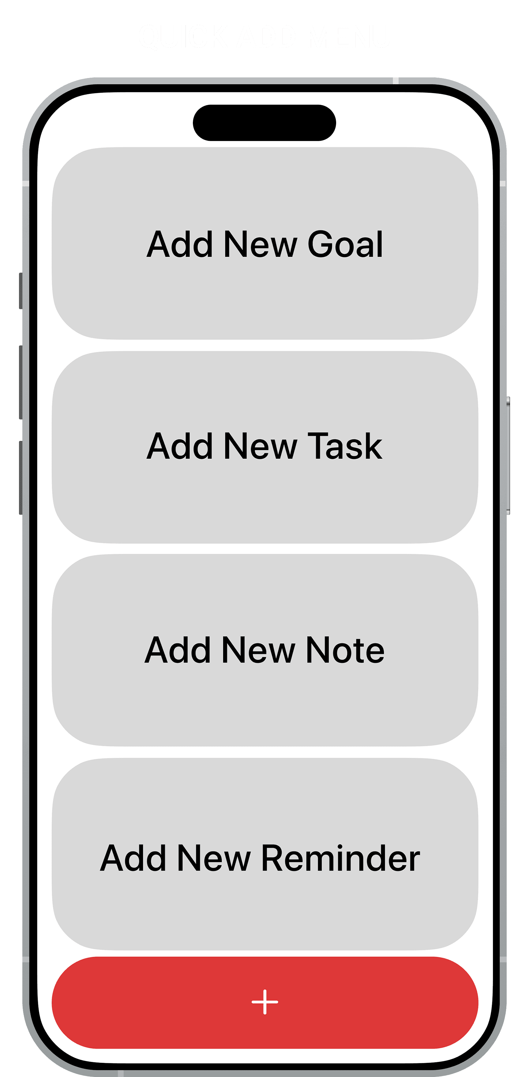
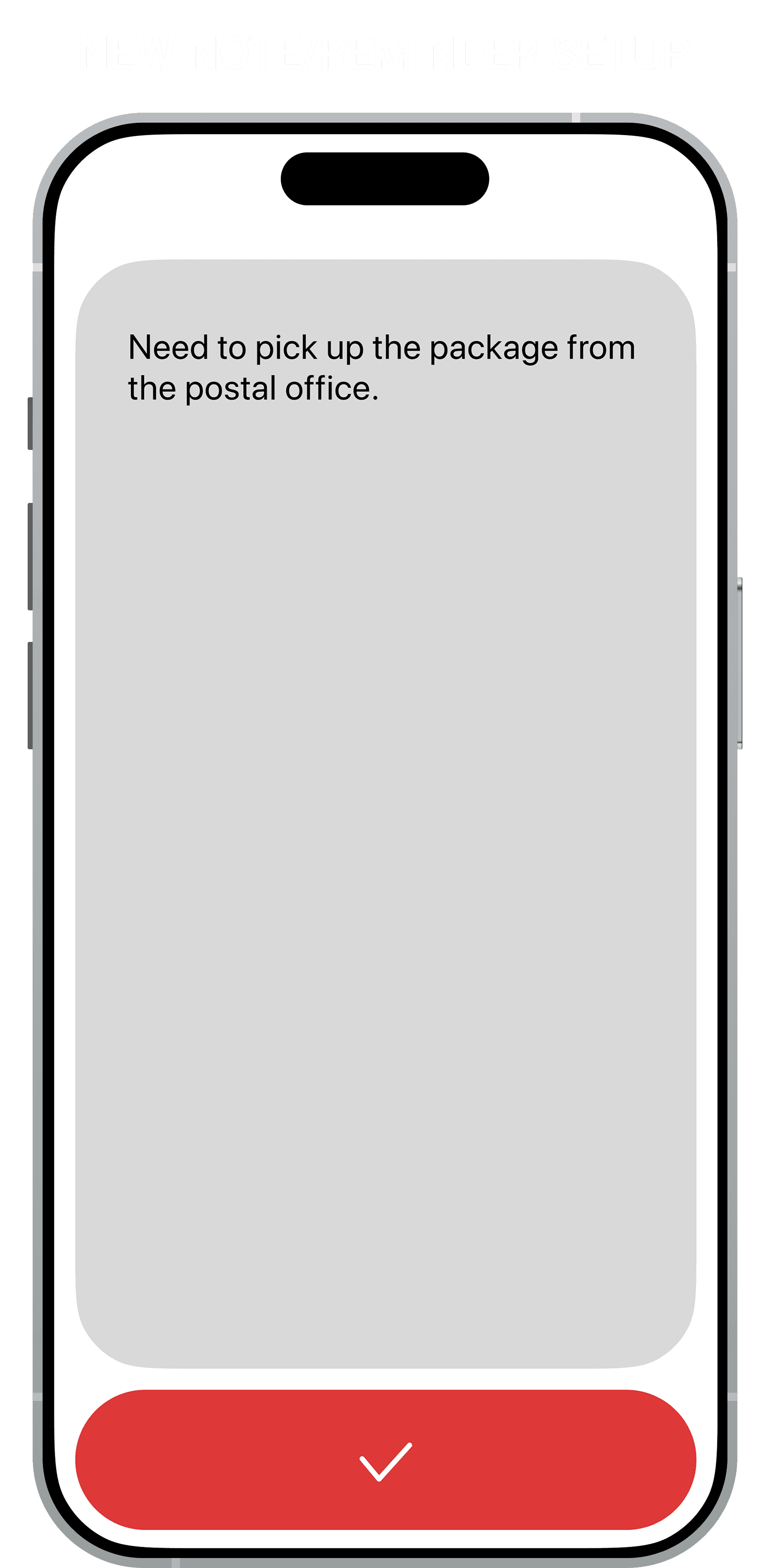
The Opportunity: There was a clear gap for a tool that prioritized speed of capture over complex categorization. The business hypothesis was simple: if we can reduce the time it takes to input a task to under 10 seconds, we can increase daily active usage (DAU) and prevent early churn

Discovery & Reframing

Initial Assumption: The initial concept was to create a better folder system, a cleaner version of existing apps


The Pivot: During the discovery phase, I analyzed user behaviors and identified a phenomenon I call "Categorization Paralysis." Users were getting stuck deciding where to put a task (Work? Personal? Urgent?) rather than just writing it down


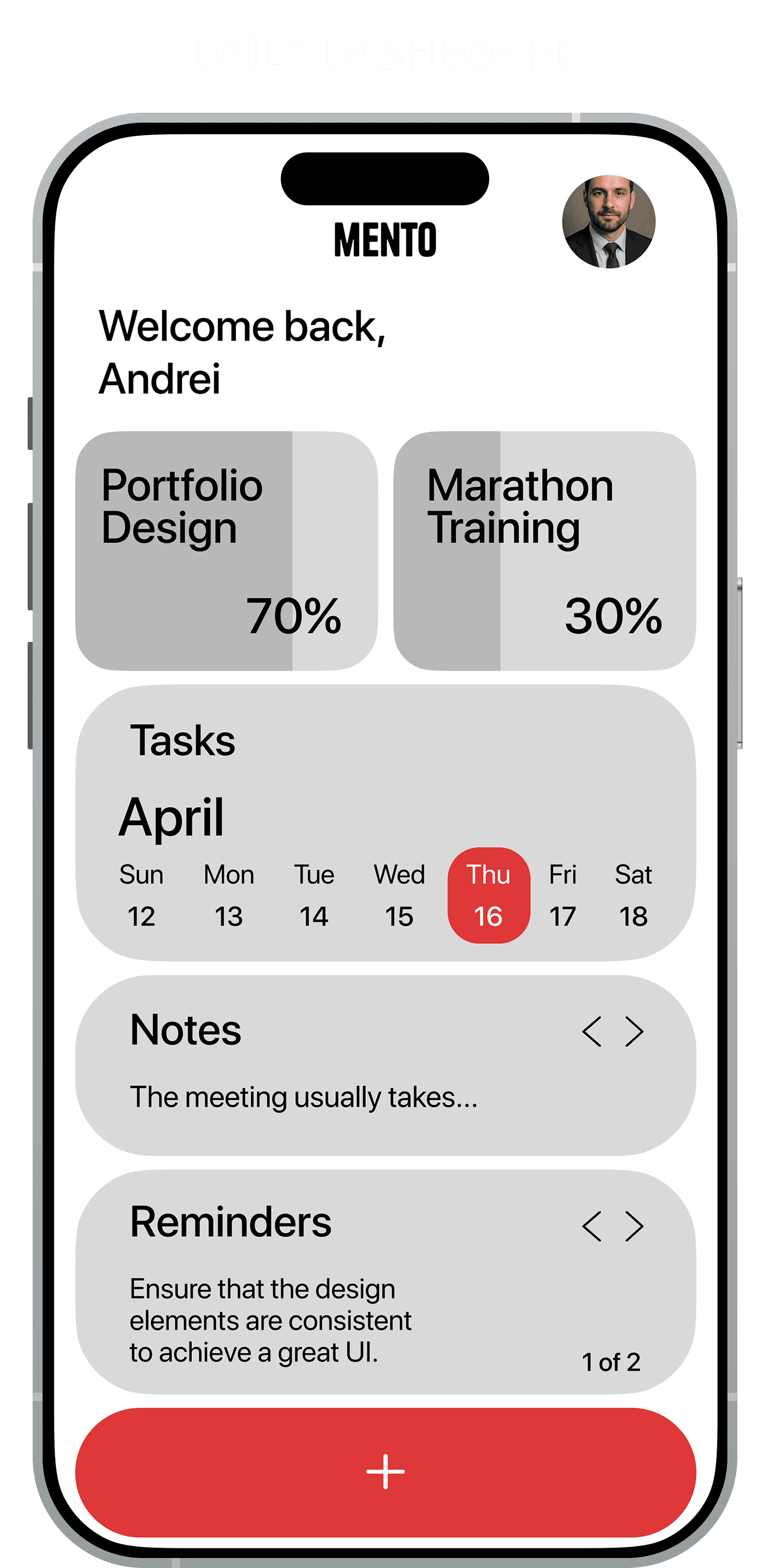
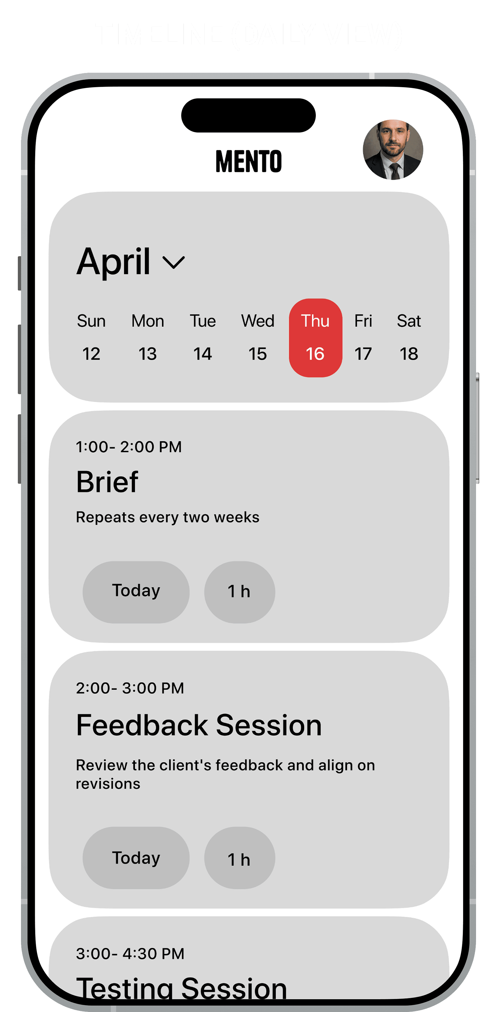
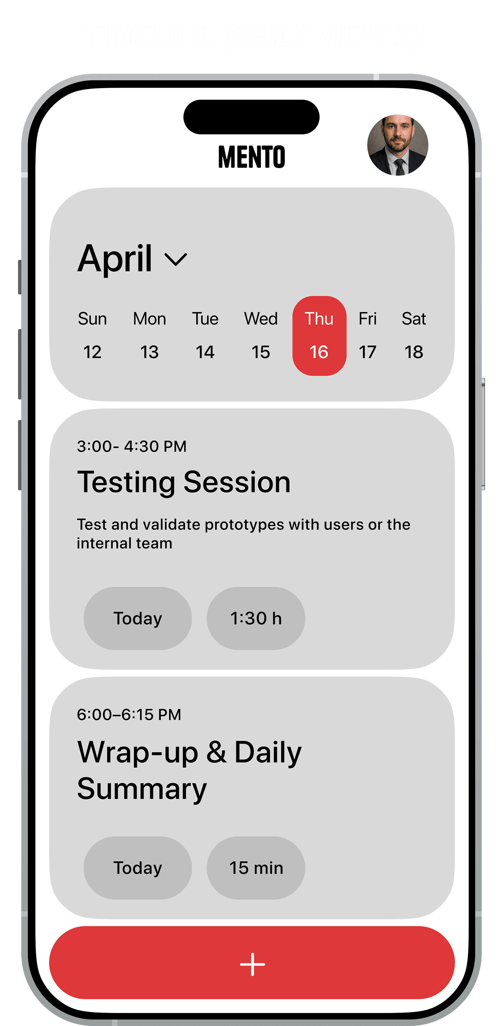
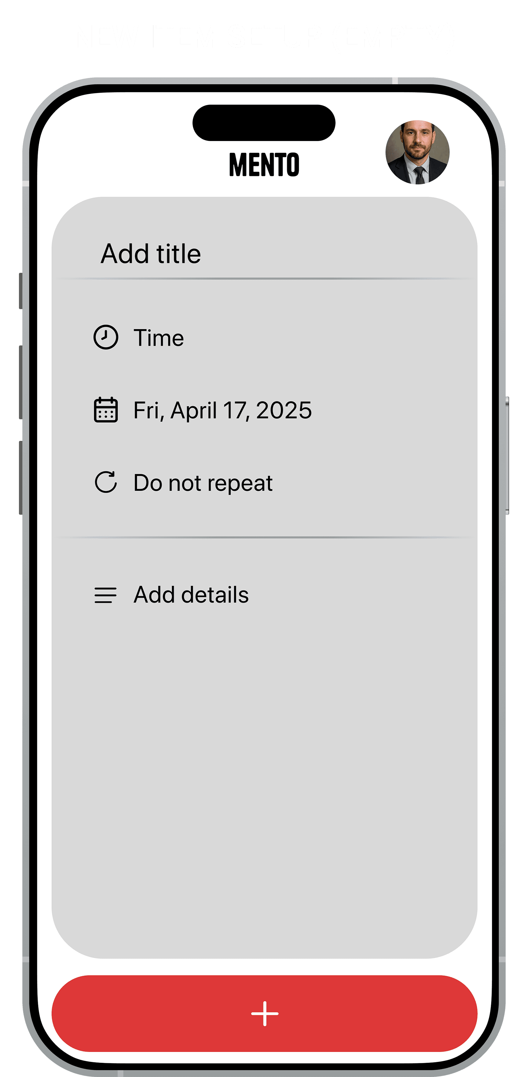
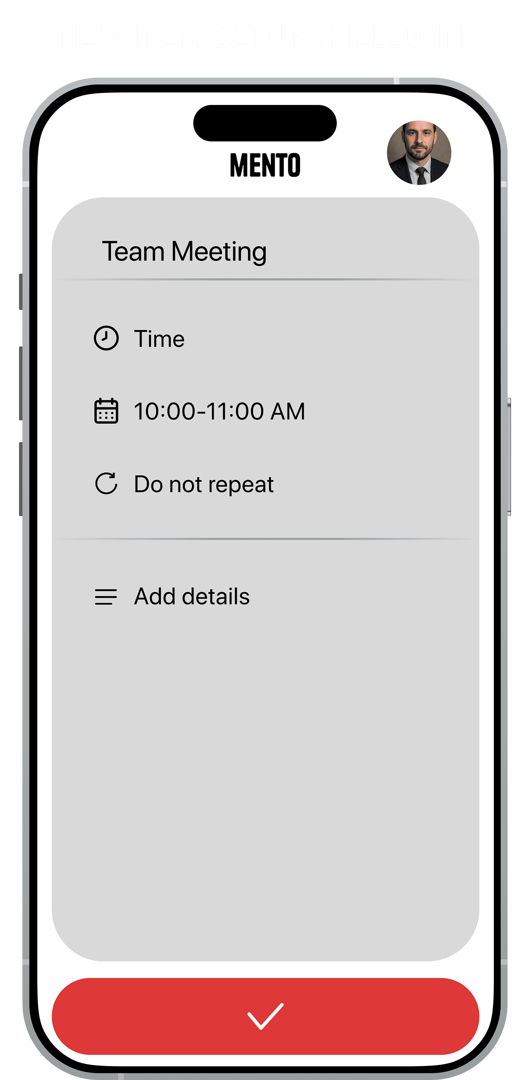
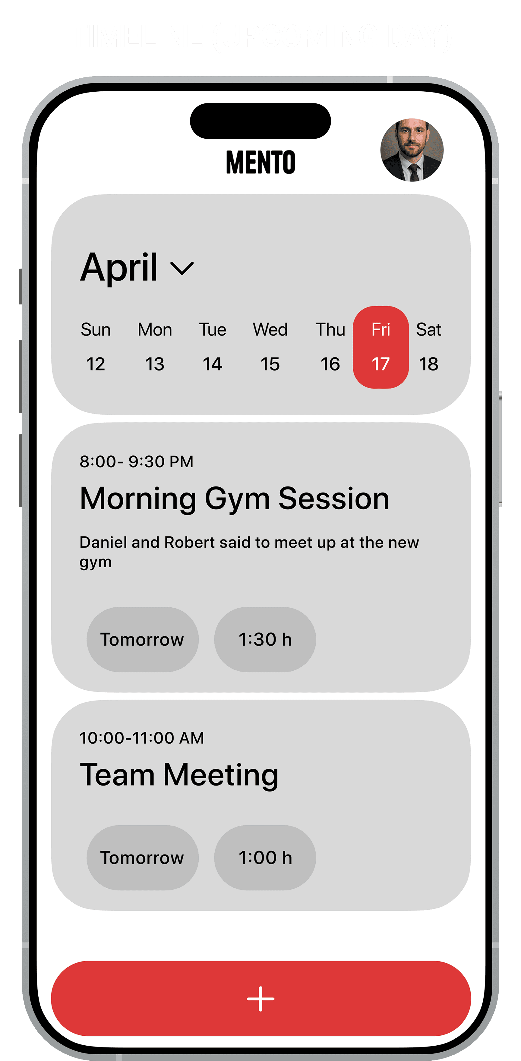
Reframed Strategy: I shifted the strategy from "Better Organization" to "Streamlined Capture." I decided to remove the concept of folders entirely in favor of a chronological timeline. This was a risky design decision, but necessary to align with the goal of reducing cognitive load

The Design Process

The Navigation Challenge: I had to reconcile four distinct object types (Goals, Tasks, Notes, Reminders) without fracturing the experience into tabs

  • The Solution: A unified chronological stream. This shifted the design challenge from "How do we organize tabs?" to "How do we differentiate content visually within one list?"

Defining the "Unified Entry": Once I committed to a single stream, the "Plus" button became the most critical interaction


  • Discarded Iteration (Contextual Menu): I initially tested small "speed dial" bubbles that kept the timeline visible. Although standard, revealed a 30% mis-tap rate when users attempted rapid entry while walking. The small touch targets caused significant friction during motion


  • The Solution (The Action Overlay): I chose a full-screen modal stack with massive, full-width touch targets. By momentarily obscuring the timeline with massive touch targets, we prioritized speed and error prevention (Fitts's Law) over context preservation


  • The Solution (The Action Overlay): I chose a full-screen modal stack with massive, full-width touch targets. By momentarily obscuring the timeline with massive touch targets, we prioritized speed and error prevention (Fitts's Law) over context preservation


Solving Hierarchy in Grayscale: I designed in low-fidelity grayscale first to ensure the hierarchy worked without relying on color as a crutch

  • The Friction & Solution: Testing revealed that without color, Goals looked identical to Tasks. Since I was constrained to a monochrome palette for the final UI, I solved this with typographic contrast. I used heavier weights and progress bars for Goals, ensuring the hierarchy functions purely on form

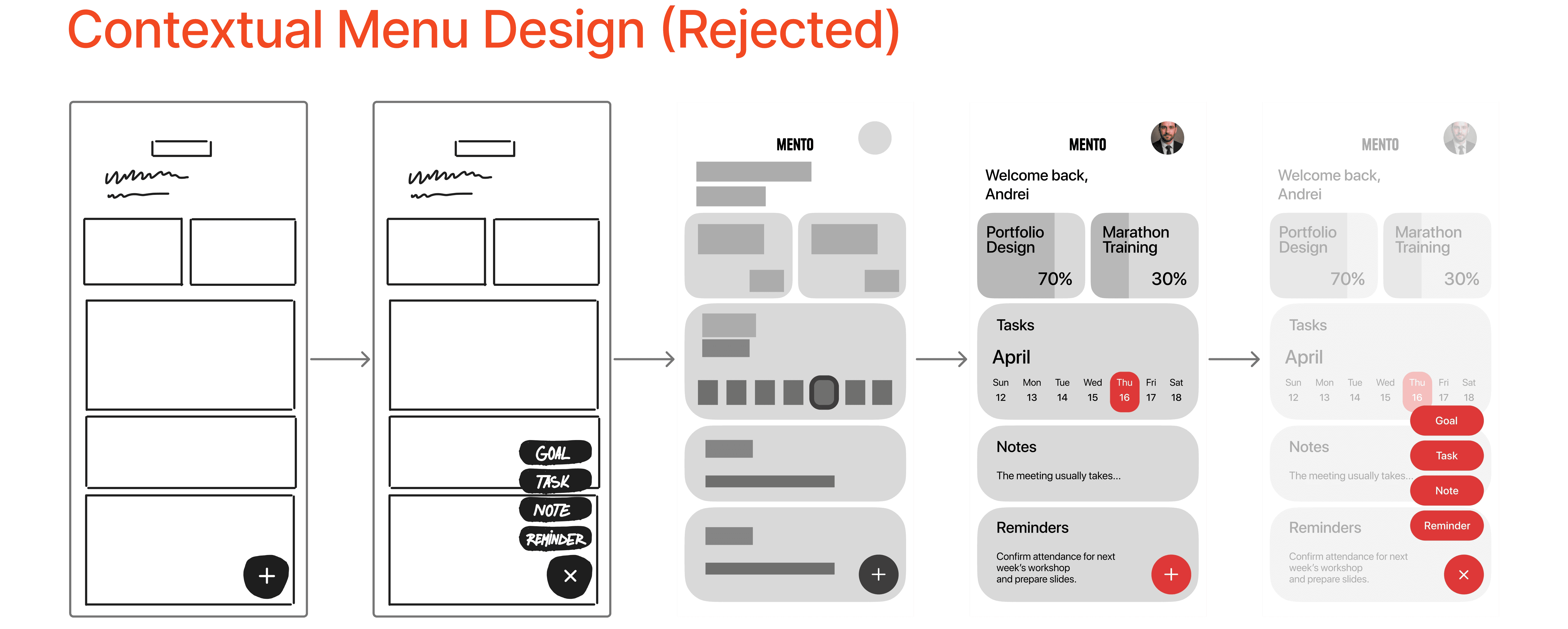
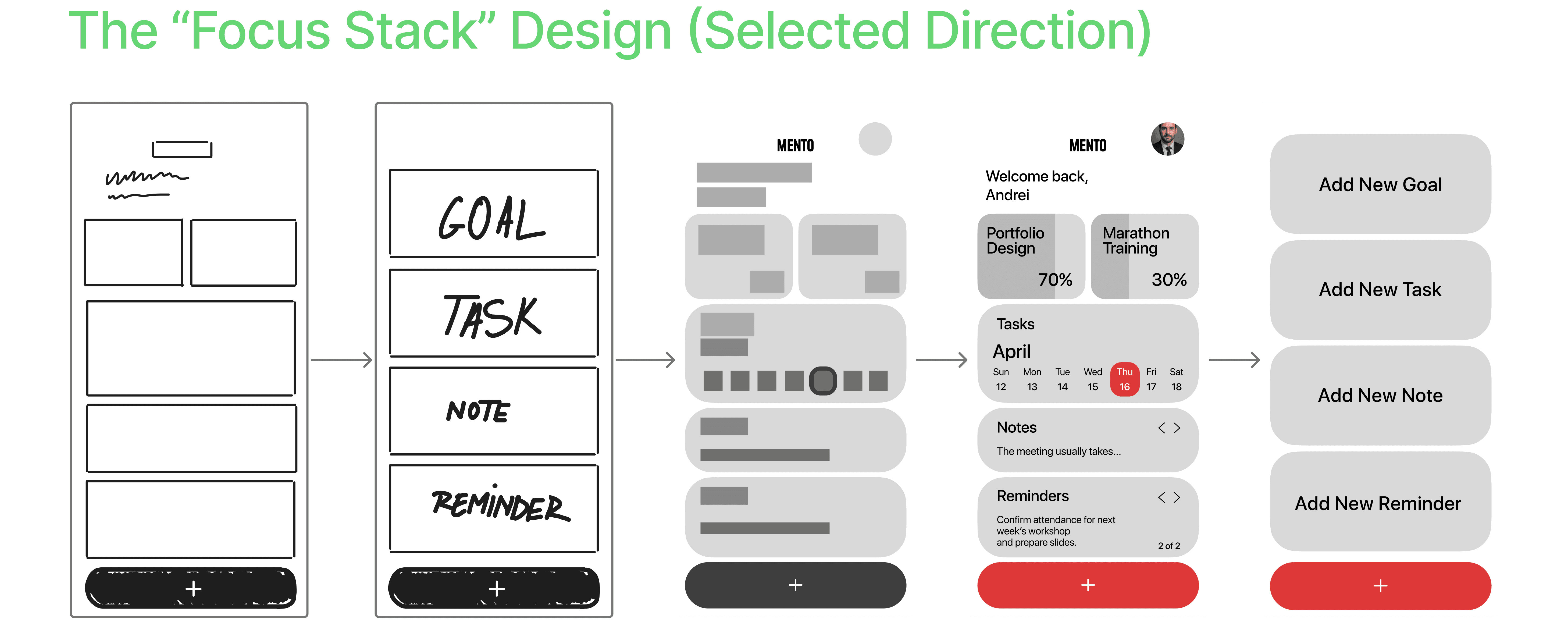
Core Mento User Flow Comparison

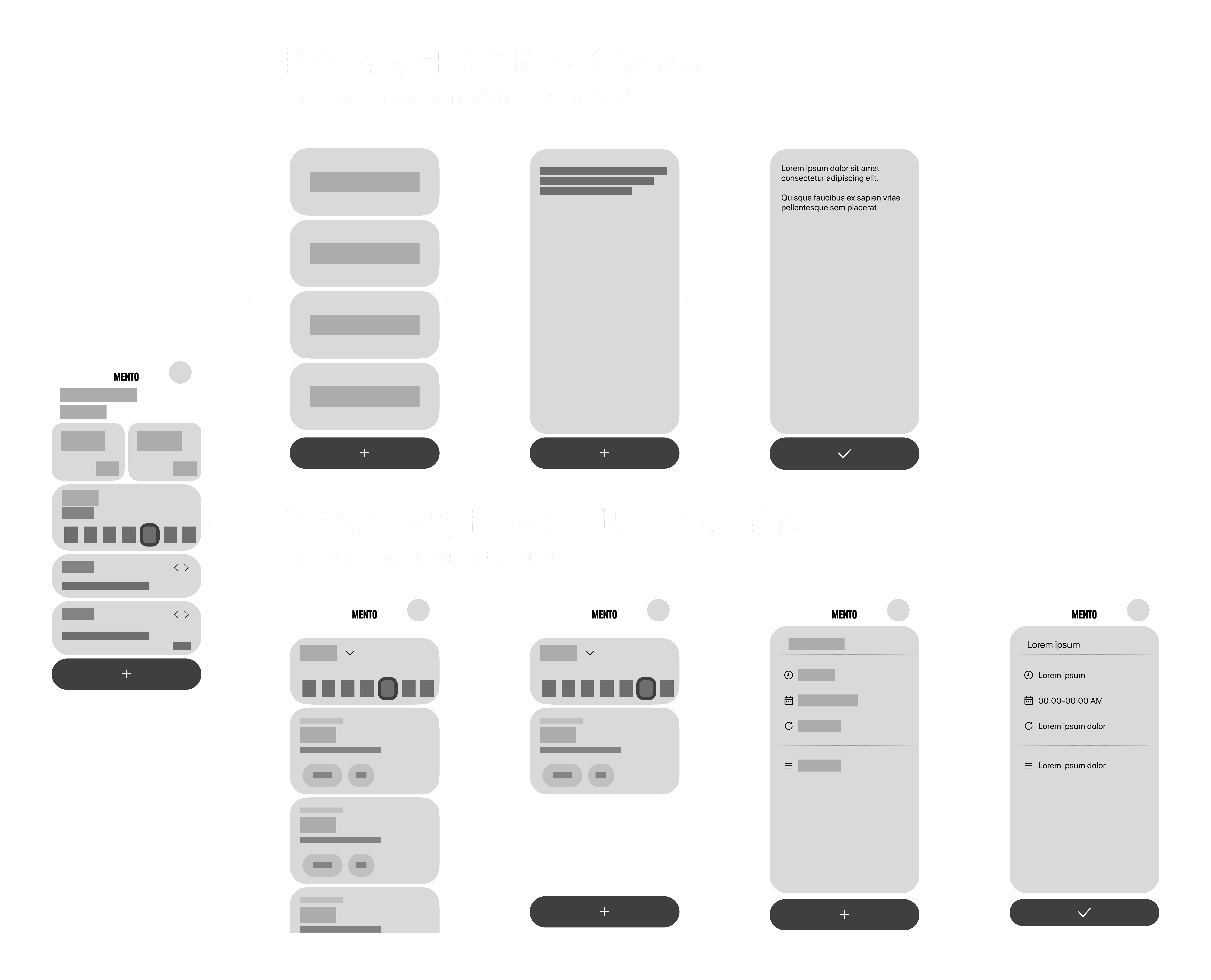
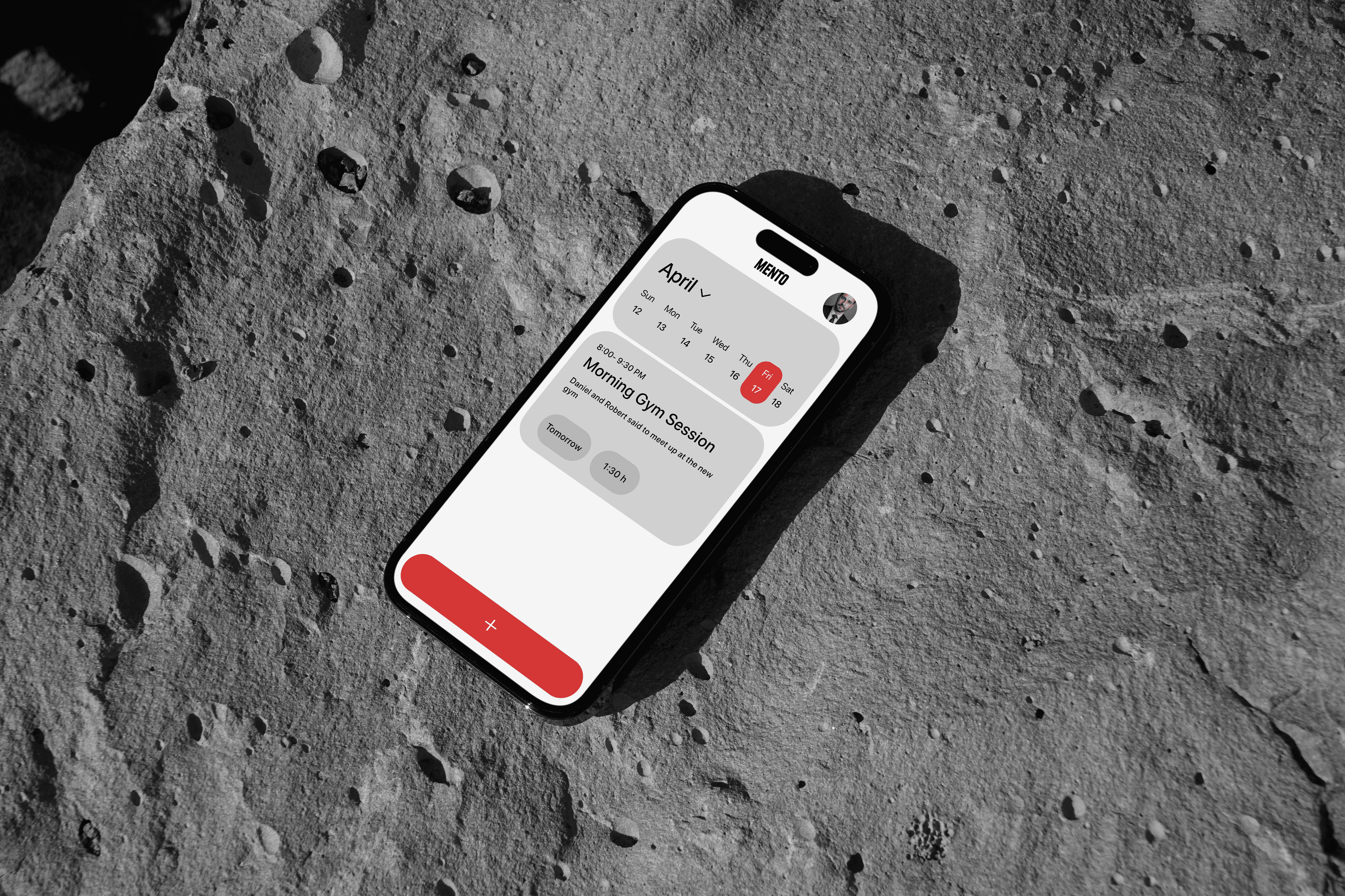
The Design System: Built for Scale

Functional Color Theory: The palette is strictly utilitarian. I used a Warm Grey (#E5E5E5) background to reduce eye strain compared to stark white. Red is reserved exclusively for the primary "Add" action and the "Current Date" indicator, creating a clear visual anchor that guides the eye instantly to the most critical interactive elements


Card-Based Architecture: The UI utilizes a modular card system with deep corner radius. This creates a soft interface that feels tangible and friendly, countering the often clinical feel of productivity tools

Results


Outcomes:

  • Efficiency: The "Unified Entry" model reduced the number of taps required to create a task by approximately 40% compared to standard nested-menu architectures

  • Validation: The prototype received strong positive feedback for its ability to balance minimalism with utility


Outcomes:

  • Efficiency: The "Unified Entry" model reduced the number of taps required to create a task by approximately 40% compared to standard nested-menu architectures

  • Validation: The prototype received strong positive feedback for its ability to balance minimalism with utility


Lessons Learned (The Retrospective):

  • Simple is Complex: The biggest challenge was the lack of "chrome" (UI elements) to hide behind. When you remove folders and tabs, your typography and spacing must be perfect. I learned that minimalism requires more rigorous iteration than complex maximalist designs

  • Designing for the Physical Environment: The app was initially designed for the ideal state (a user sitting still). However, mobile productivity apps are often used in motion. I learned that what works on a desktop mock-up fails in real-life scenarios