Taken apart
The bottle opens up layer by layer in a sunlit room, cap to base, then closes back into one piece and the price.
Piurify sells a hydrogen water bottle in the US, on its own store and on Amazon. I designed the static and video ads for its Meta campaigns: concepts written for specific audiences, tested in visual variants, and a two-bottle offer for the autumn.
What I did
The brief
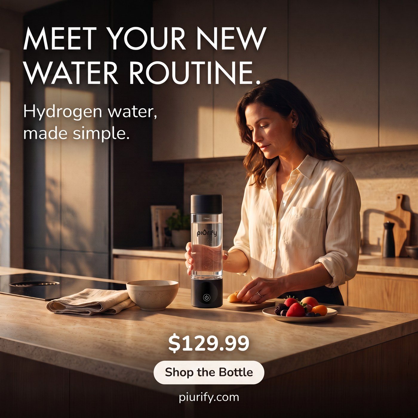
Hydrogen water is still new to most people in the US, and a $129.99 bottle needs a clear reason to stop scrolling. Piurify wanted ads built on what the bottle is and what it’s like to own: one button, a 5 or 10 minute cycle, a third-party lab result and a two-bottle offer.
So the brief became a design problem: make the bottle easy to picture in someone’s day. What’s in the box, how it works, where it fits, and who the second bottle is for.
message concepts in the September test, each built in A, B and C visual variants.
audience segments in the targeting plan, from teachers and drivers to couples buying two bottles.
concepts in the 21 October round, each exported in 1:1, 4:5 and 9:16.
Six rules for every Piurify ad, from a 1:1 static to a 9:16 video.
Every ad leads with the bottle itself: in a hand, on a desk, on a court, out of the box.
Each concept is written for someone specific: a teacher, a first-time buyer, a couple.
One sentence on the image. Specs go in a short line underneath, not in the headline.
Inside a concept the copy stays the same, so the test reads the picture.
Numbers only when there is a document behind them, like the H2 Analytics lab result.
Bundle price, the saving and the single-bottle price in one block, always in the same place.
Creative testing
In September the account tested three message concepts, each in A, B and C visual variants with the copy fixed, so a result read the picture, not the sentence.
The 21 October round went further: seven concepts, each built around a different reason to buy, from the gift and the unboxing to a job, a family joke and the lab result, each shipped in feed, Instagram and story sizes. Shown here: four of them, next to two ads from the round before.
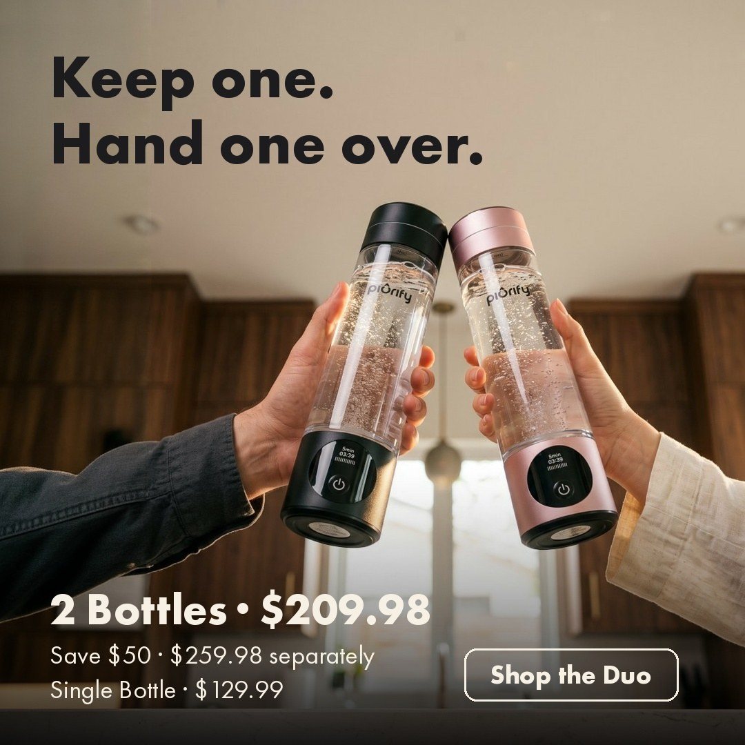
“Keep one. Hand one over.” The two-bottle offer as a gesture between two people.
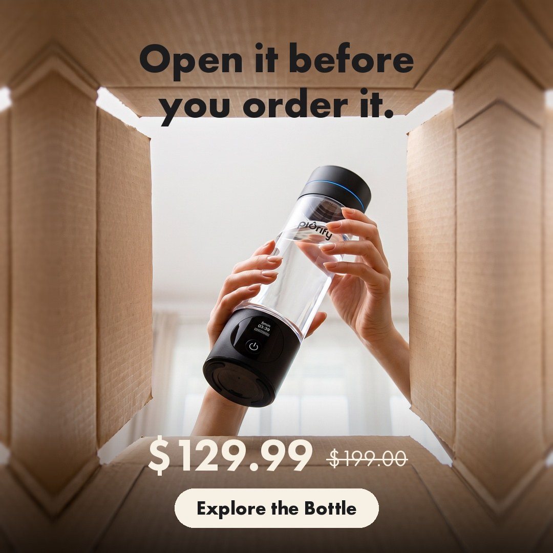
“Open it before you order it.” Shot from inside the box, for people who want to see what arrives.
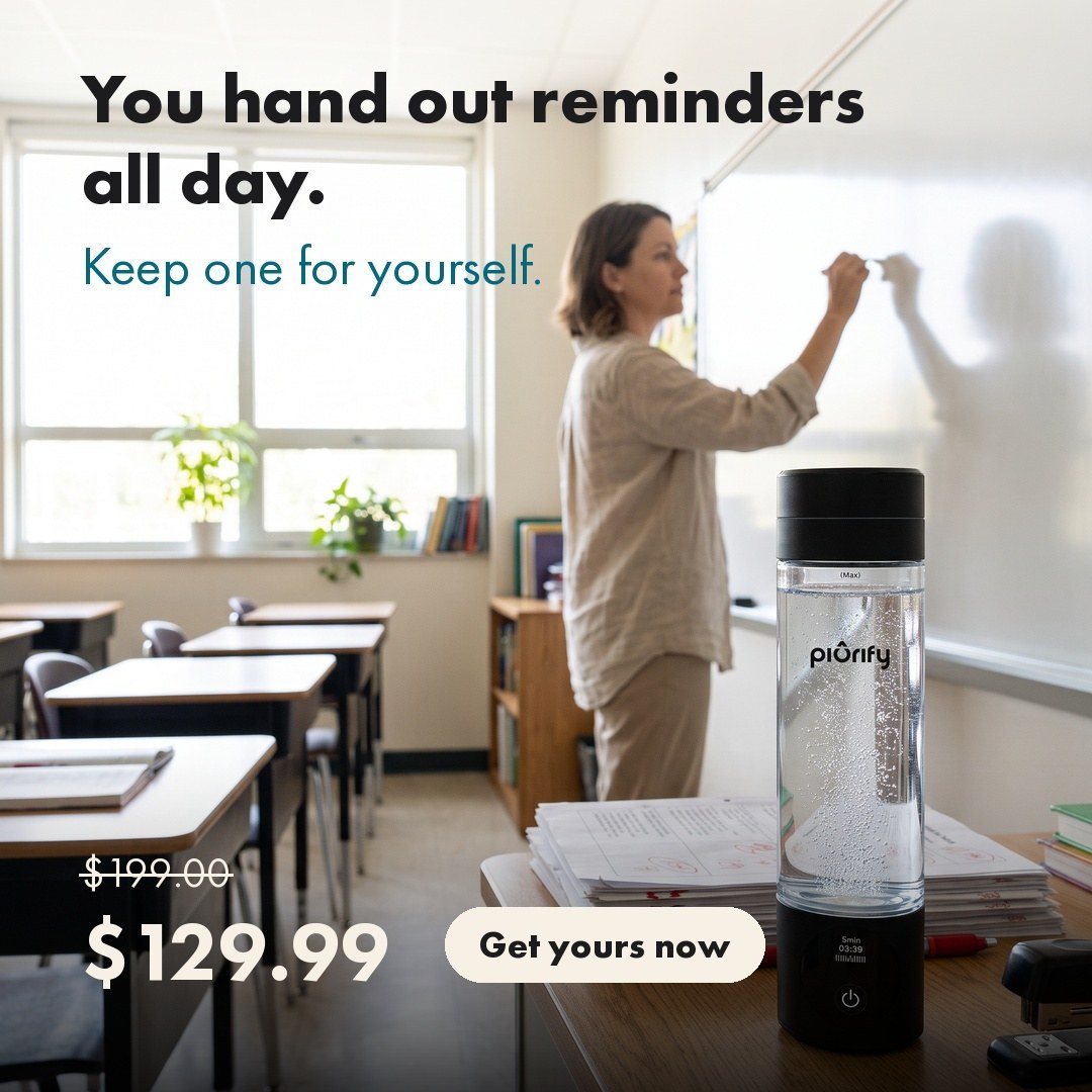
“You hand out reminders all day. Keep one for yourself.” One job, one scene.
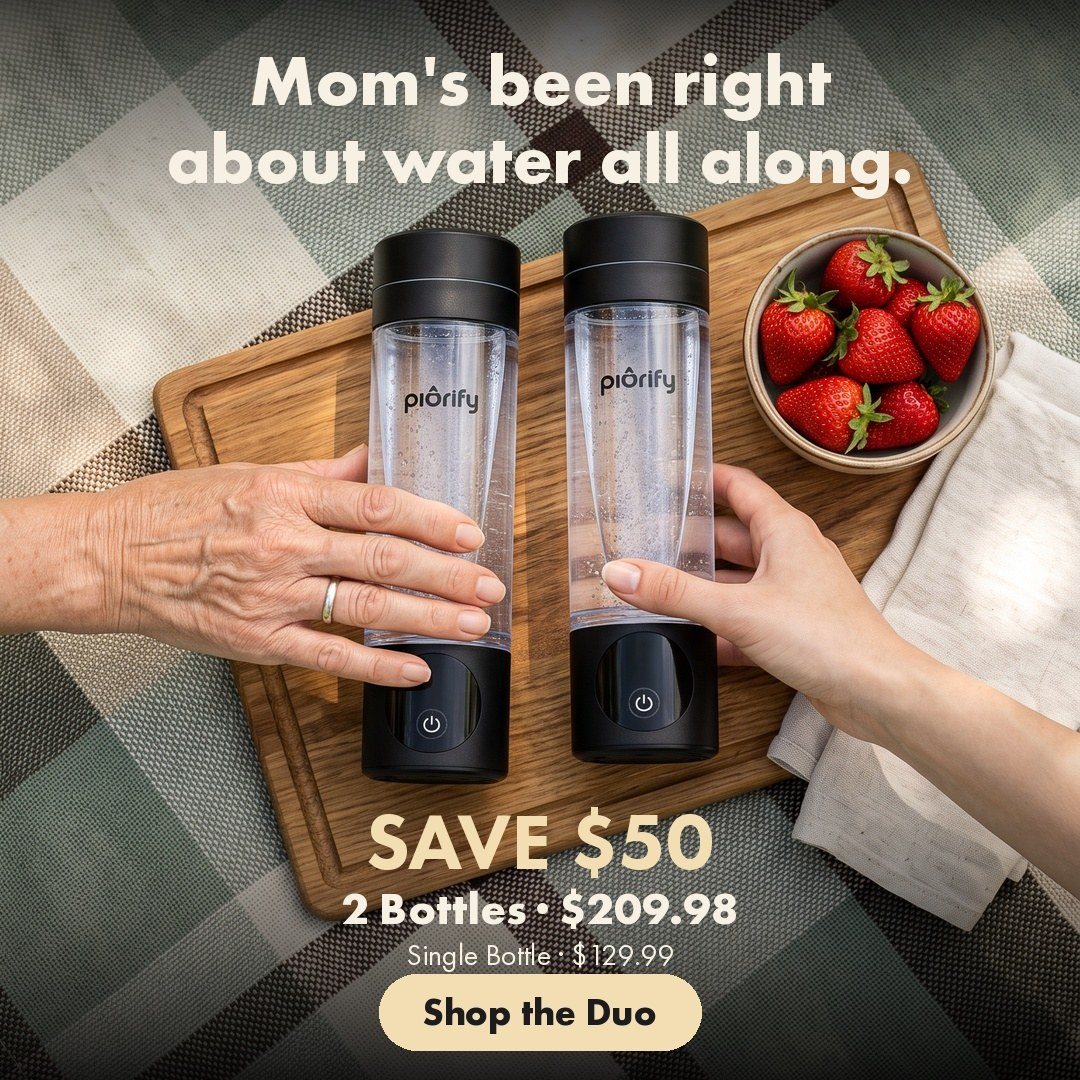
“Mom’s been right about water all along.” The two-bottle offer with a wink.
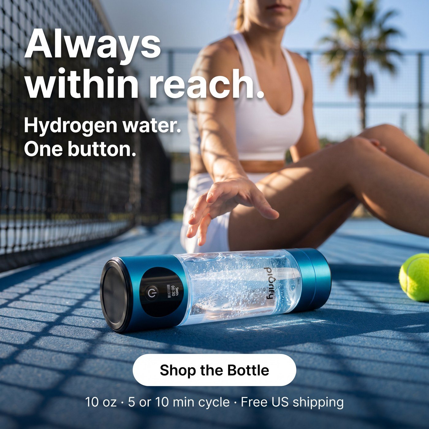
“Always within reach.” The bottle on a tennis court, with one button and the cycle time as the only specs.
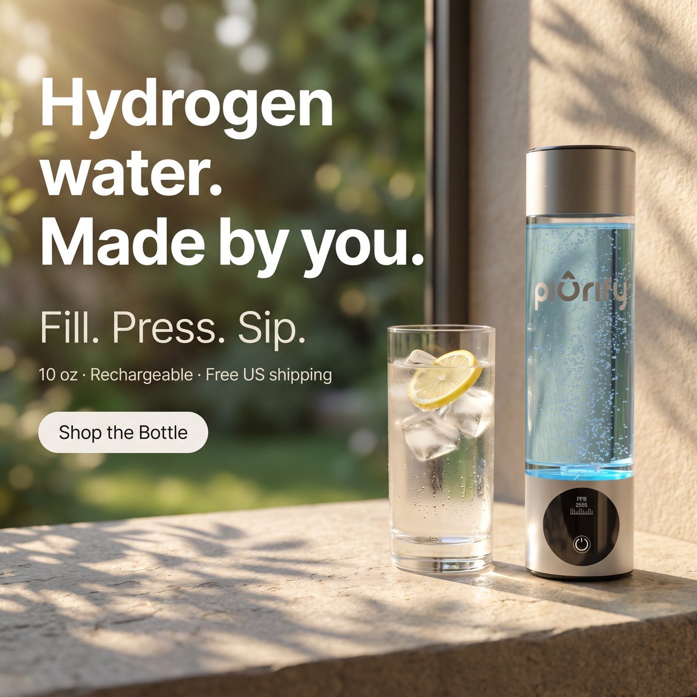
“Hydrogen water. Made by you.” Fill, press, sip, on a sunny ledge next to a glass of lemon water.
Decision
Each ad argues one thing. If a concept wins, the account knows which reason did it.
Decision
One button, a 5 or 10 minute cycle, USB-C. Short, concrete and easy to read on a phone.
Decision
Concept names, sizes and copy are set up so the results can be read per concept.
The result: In the account’s best prospecting audience, the “What you get in the box” static returned $1.84 for every dollar spent, more than double the account average of $0.86 over the same weeks.
Offer design
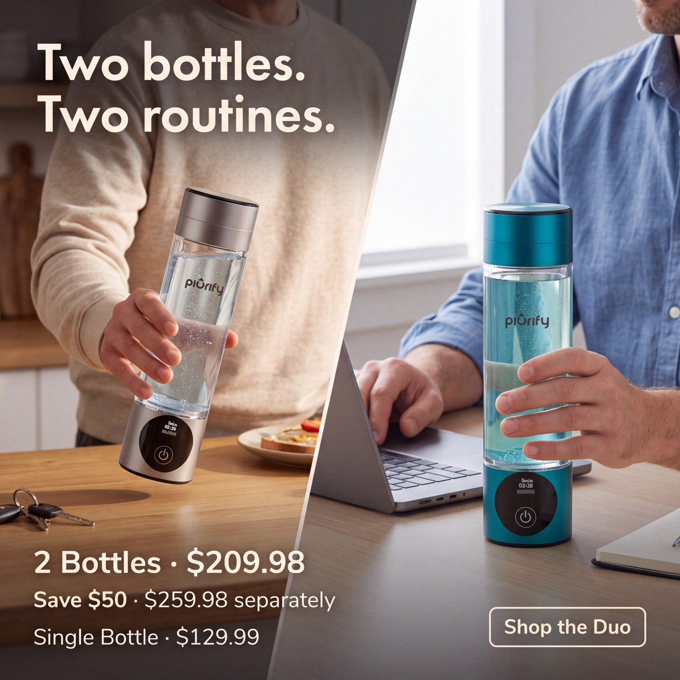
For the autumn, Piurify sold two bottles together, also used for Amazon’s Prime Big Deal Days. A bundle is a price story. I made it a people story: two bottles clinking in a kitchen, one for you and one for Mom, one for home and one for the gym bag.
The offer always sits in the same block under the image: two bottles, the bundle price, what you save against buying them separately, and the single-bottle price for comparison.
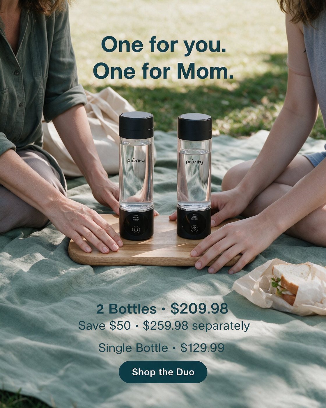
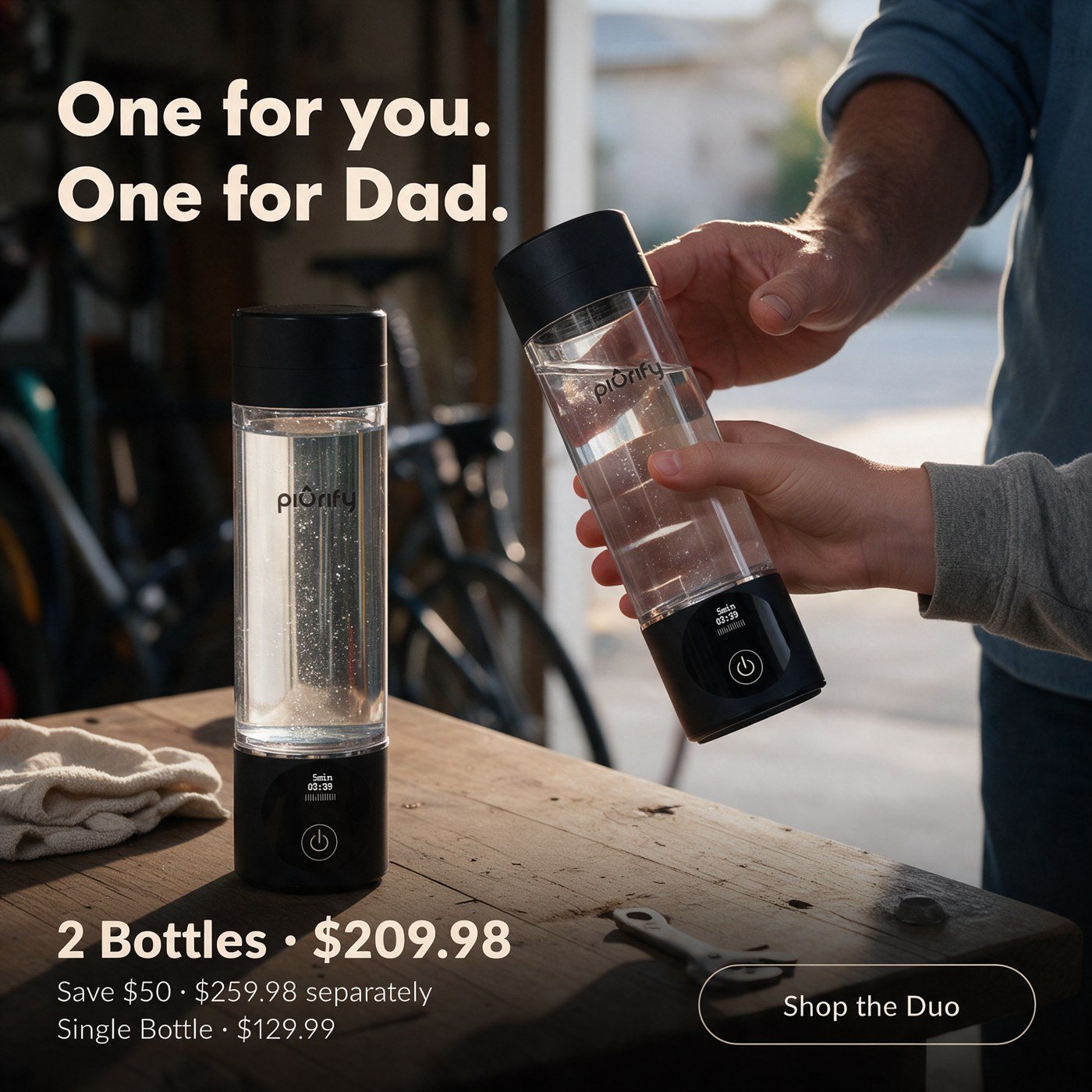
A picnic and two people. The second bottle has a person attached to it.
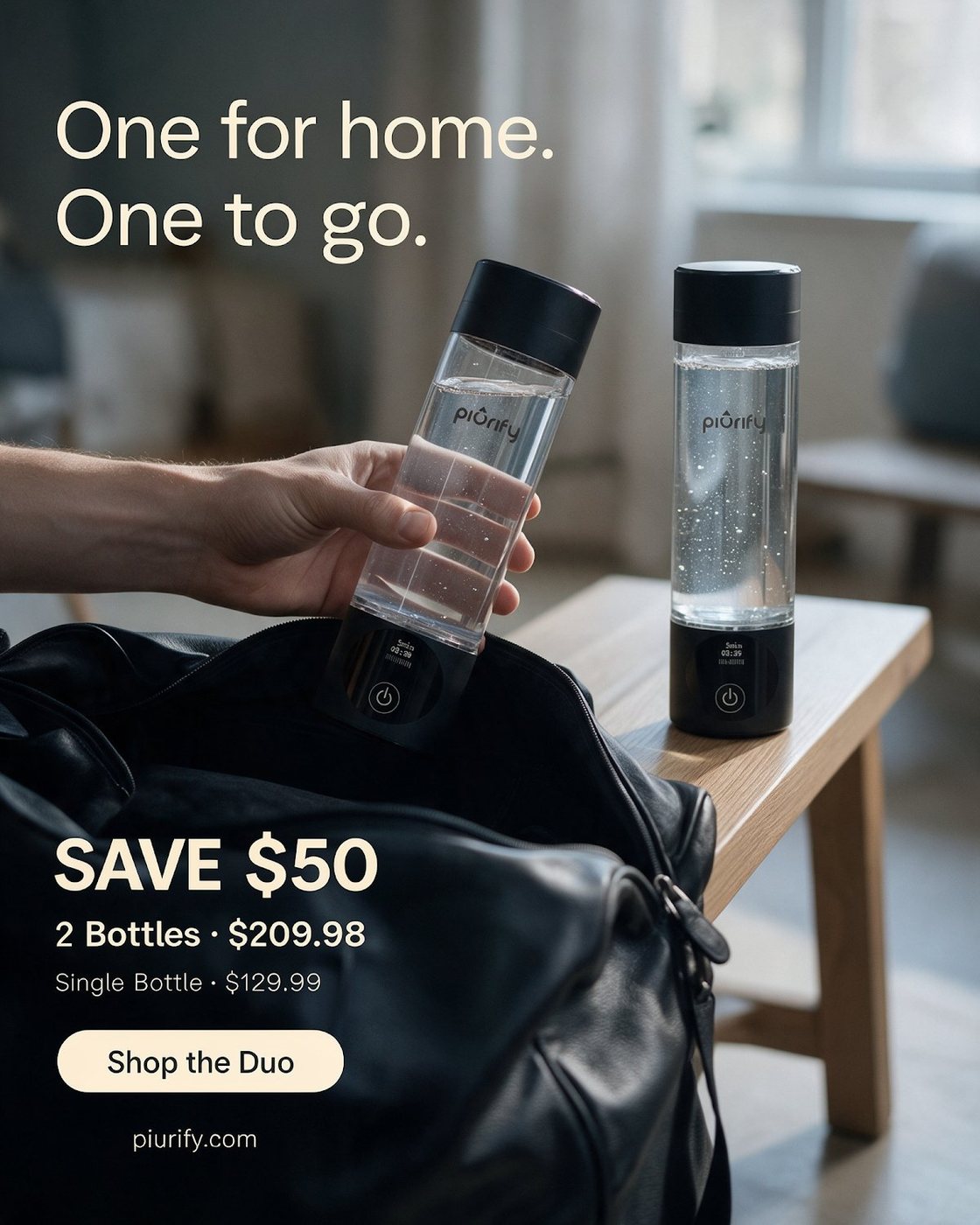
One stays home, one goes in the gym bag. The bundle explained without a word about price.
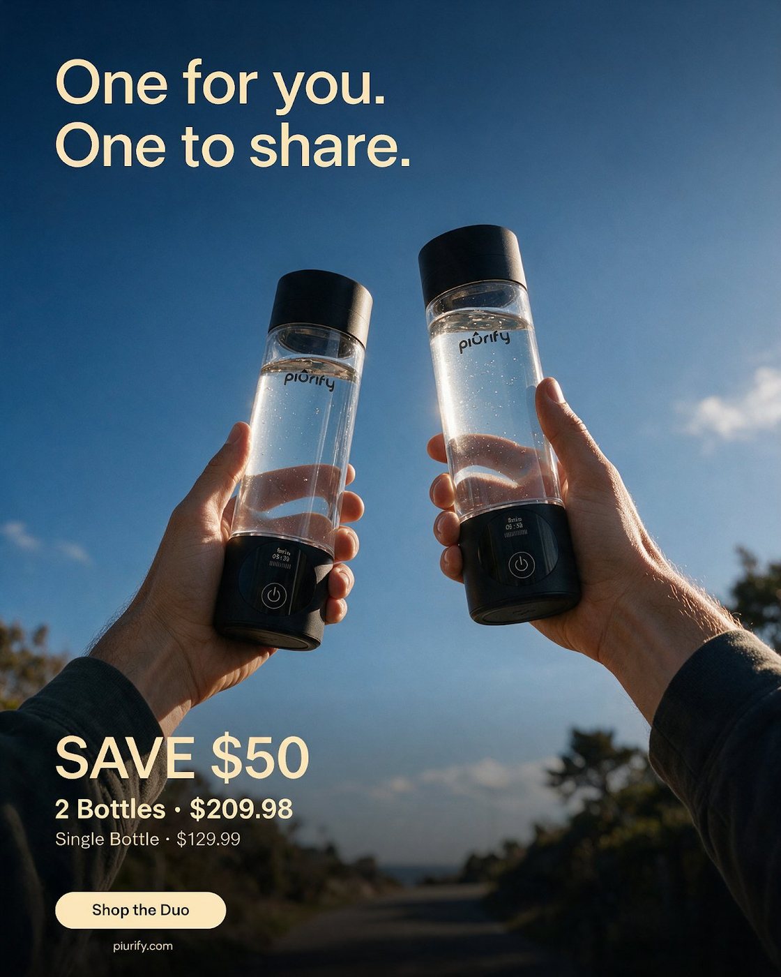
For the Amazon event: two bottles against the sky, the saving in one line.
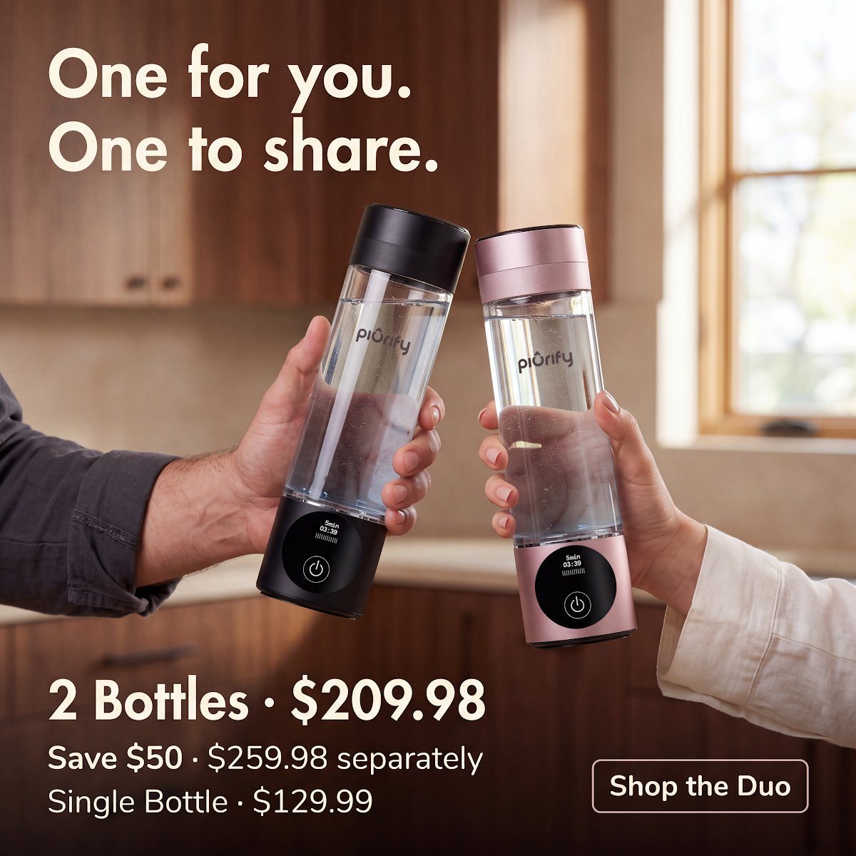
Two bottles clinking: the gift is in the gesture, the price is underneath.
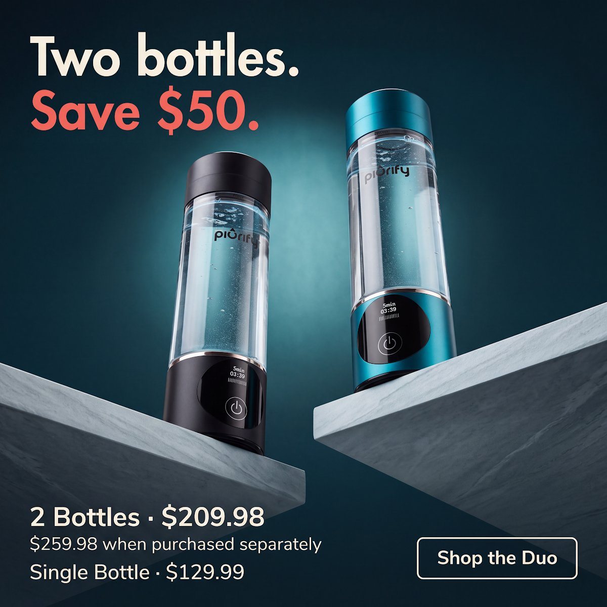
The studio version for people who decide on price: two bottles, one number.
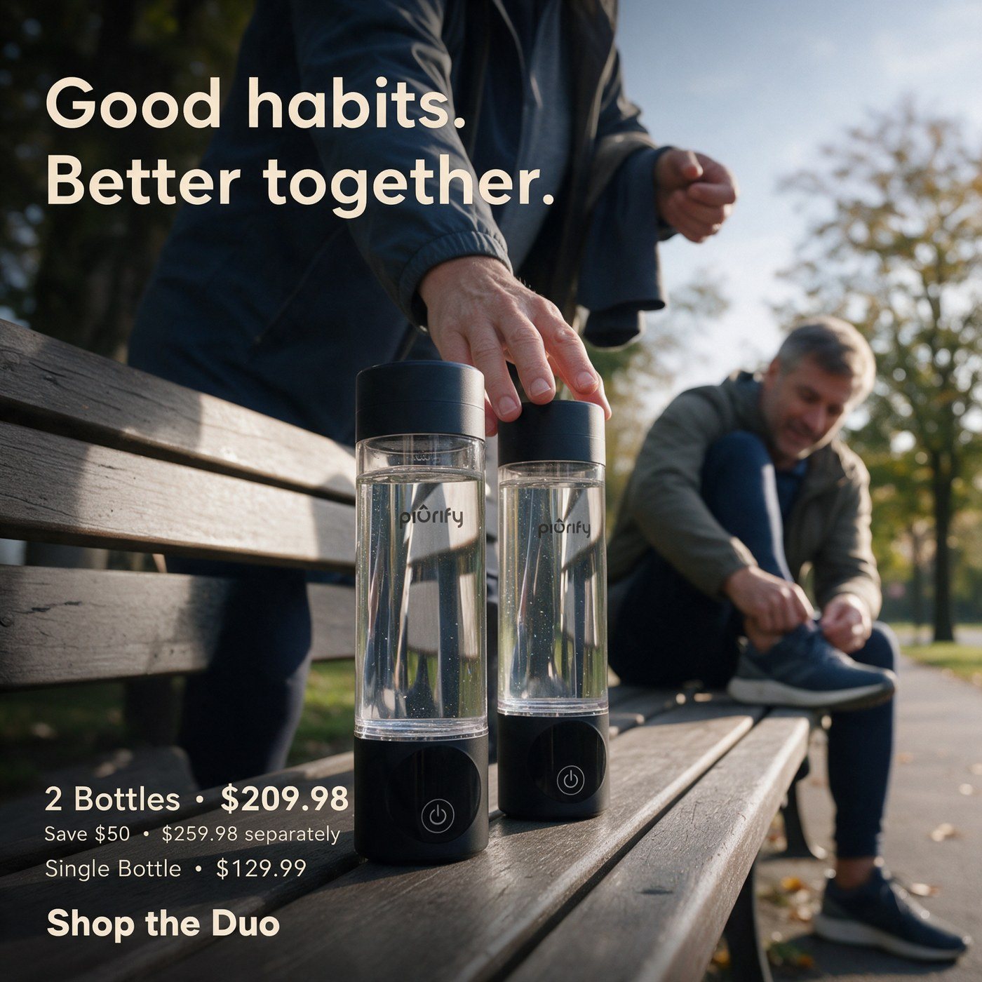
“Good habits. Better together.” Two bottles on a park bench, one for each of you.
The result: “One for you. One to share.” in the kitchen brought in purchases at $77 each, less than half the account average of $190 over the same weeks.
Audience concepts
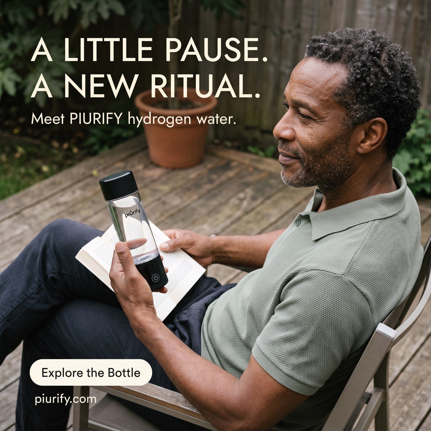
The October targeting plan split the audience into six groups, from drivers and teachers to couples over 55 and women over 65. The bottle and the offer stay the same; the scene and the first line change.
Every concept was laid out once and exported to 1:1 for feed, 4:5 for Instagram and 9:16 for stories, with the copy and the button moved so nothing sits under the platform’s interface.
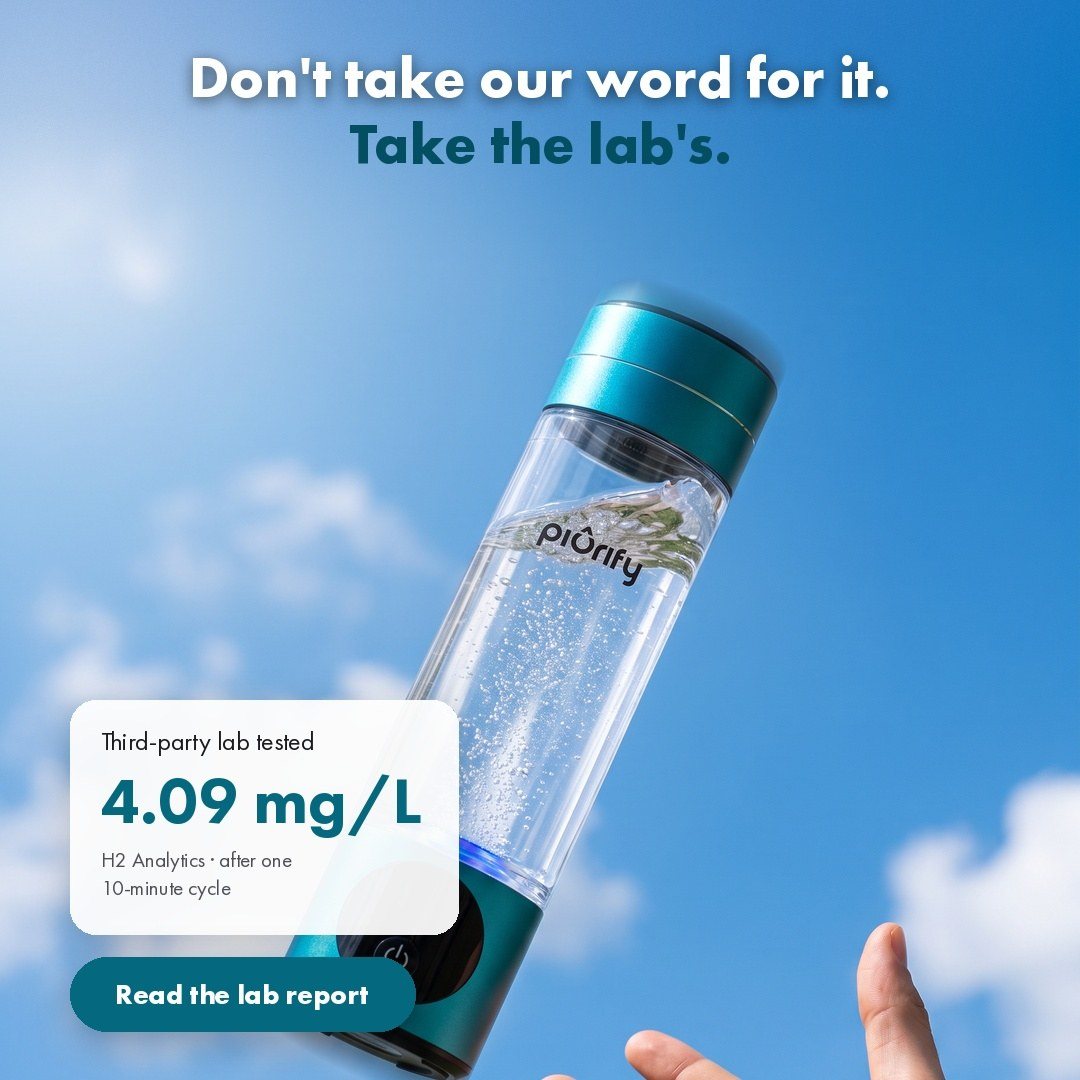
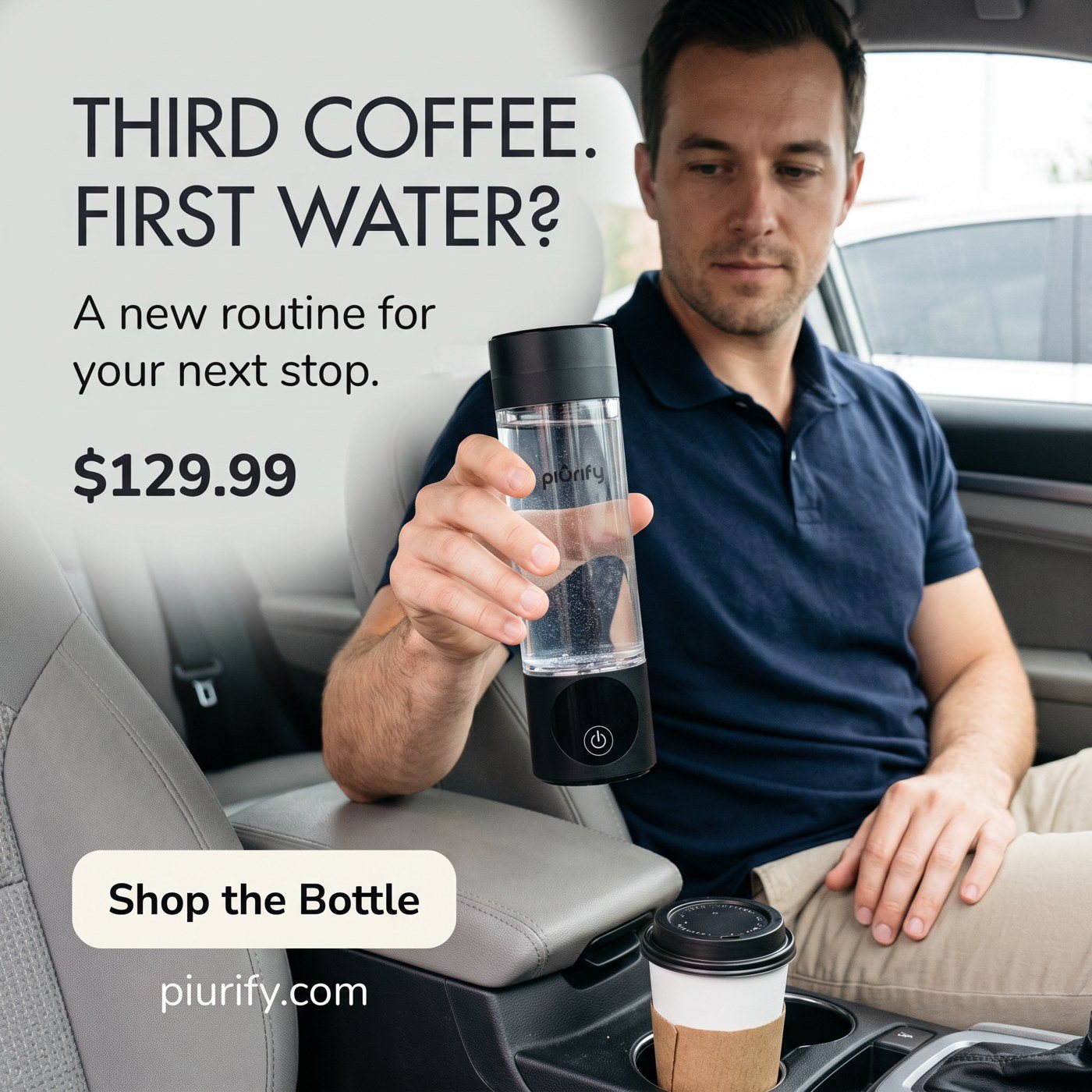
“Third coffee. First water?” A long day on the road, one bottle within reach.
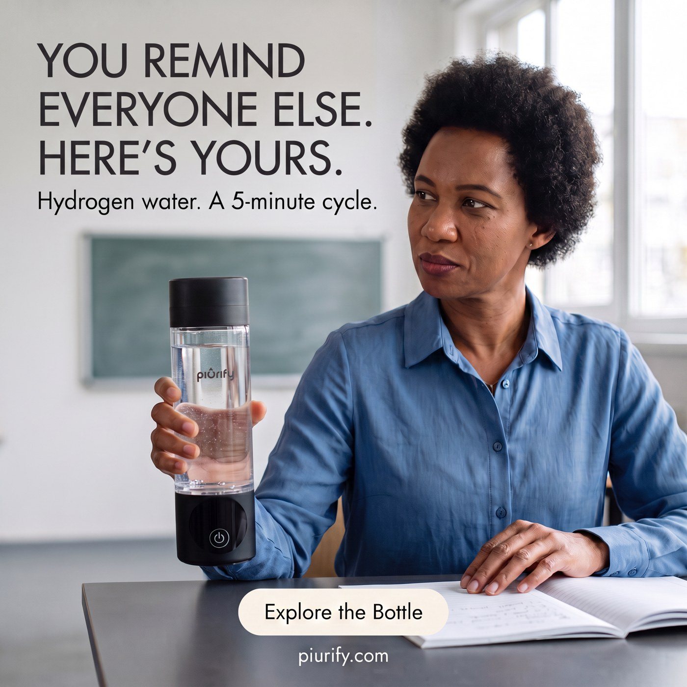
“You remind everyone else. Here’s yours.” Written for one job, in one scene.
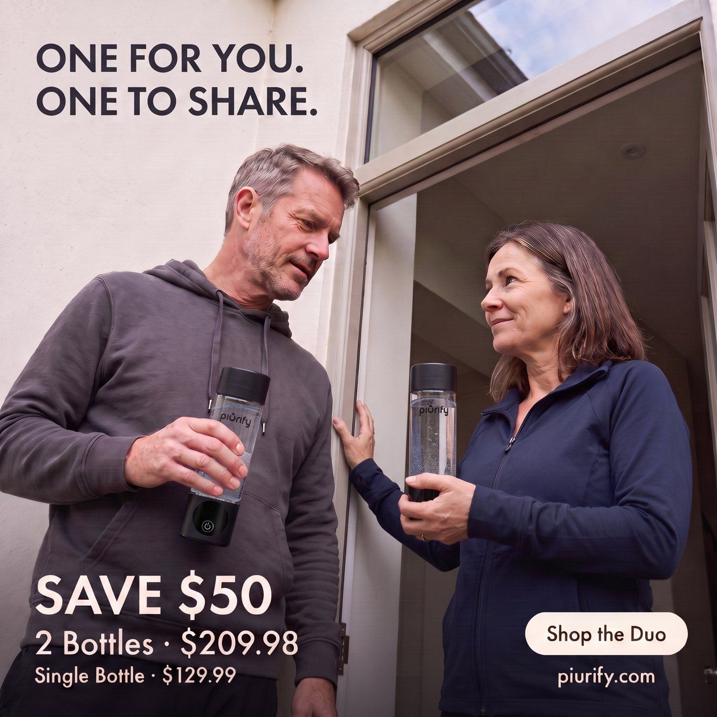
“One for you. One to share.” The two-bottle offer for people who already share a kitchen.
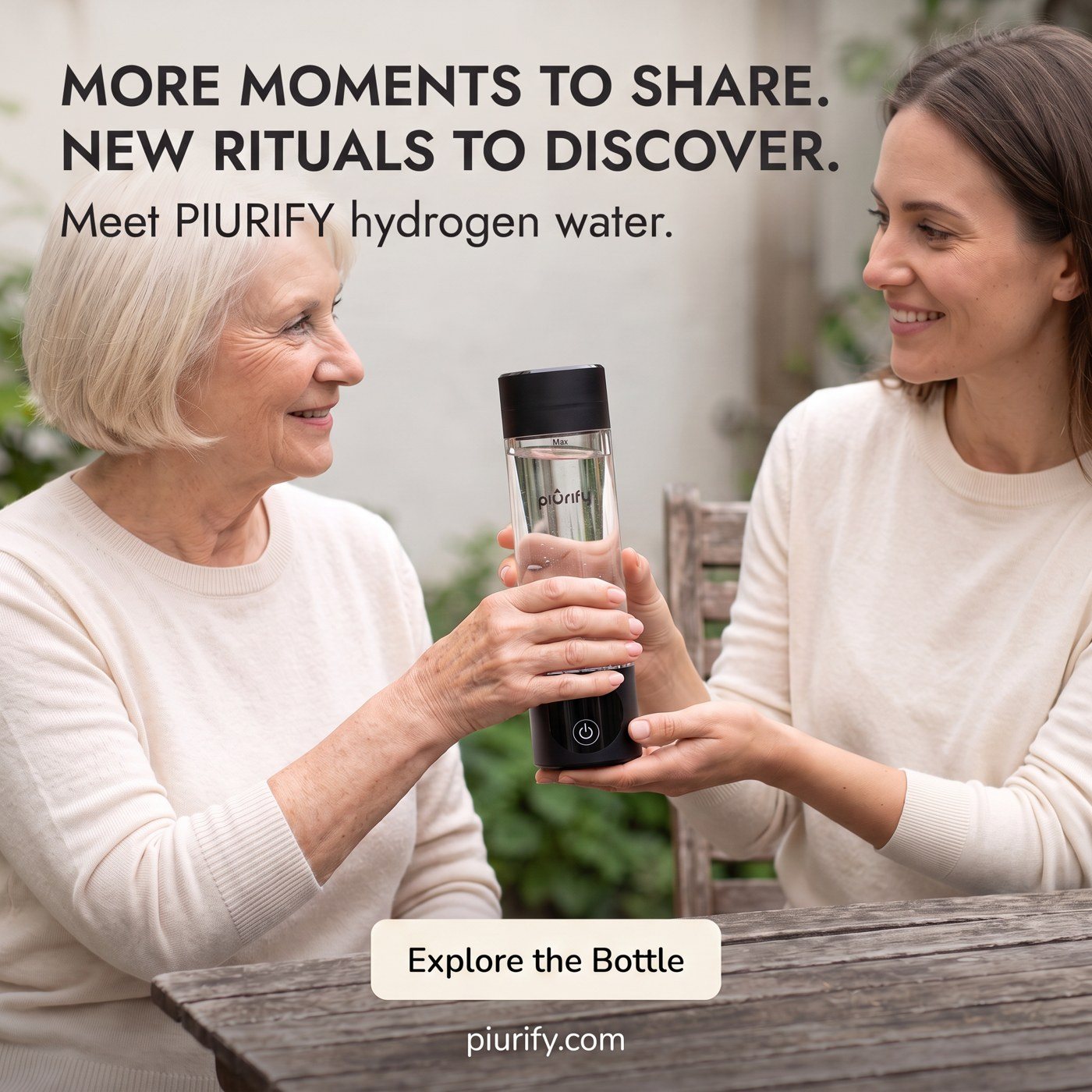
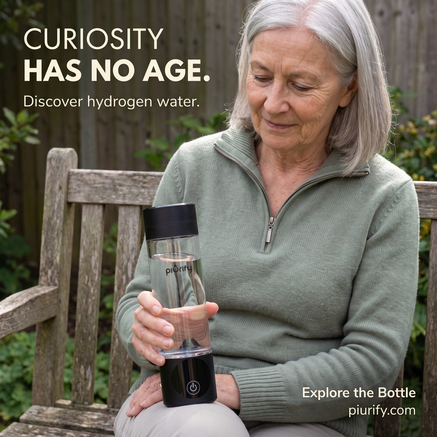
“More moments to share. New rituals to discover.” Curiosity, not age, as the reason to try it.
The result: The teacher concept “You remind everyone else” had the lowest cost per purchase of the October audience set: $71, against an account average of $190.
Video
The video ads follow the statics: the bottle in a real place, one line on screen at a time, the offer at the end. Three AI films, three jobs: one takes the bottle apart, one follows it through a day in first person and sells the two-bottle offer, and one explains hydrogen water to people who have never heard of it.
The bottle opens up layer by layer in a sunlit room, cap to base, then closes back into one piece and the price.
“Meet Piurify.” Shot from the hand on a track, in the gym and on a park path, ending on one for you, one to share and the $209.98 offer.
“What is hydrogen water, actually?” Water with hydrogen dissolved in it, then hold to start, press again, 10 minutes.
For the “One for you. One to share.” campaign I designed the email that took the two-bottle offer to Piurify’s list. The hero is built from the campaign photo: the two hands cut out and laid over a giant “TWO”, the saving on a sticker, one button.
Below it the email turns the bundle into a choice of colours, explains the bottle in three words and shows the lab result with its source. Headlines, prices and buttons are live text in the brand’s Jost and Nunito Sans.
Scroll the email. The note follows the section you’re on.
Preheader
“Two bottles for $209.98, until November 18” is the first line in the inbox. The deadline is the reason to open today.
Hero
The two hands from the campaign photo, cut out and laid over a giant TWO, so the offer reads as a gesture before anyone reads the price. One sticker for the saving, one button.
Colours
Four colours and ten possible pairs at the same price. Picking colours is more fun than reading a bundle price, and every tile opens the shop.
How it works
Fill, press, sip. Hydrogen water is new to most people, so the email shows how simple the bottle is before it asks for anything.
Proof
The lab result as a big figure, the lab named next to it and a link to the full report.
Close
The studio shot of two bottles and the campaign line, “Keep one. Hand one over.”, then the last button.

Results
Every Piurify ad shows the product, one reason to buy and a real price, and every round is built so its result can be read.
brand-store sales per day in September and October 2026, against the summer before
What I learned: the strongest Piurify concepts are the simplest ones: the bottle in someone’s hand, in a place you recognise.
Questions
Hydrogen water is new to most people. Showing the bottle in use, the one button and the lab result explains it faster than a slogan.
Three message concepts, each in A, B and C. The copy stayed the same inside a concept and only the image changed, so the results compare pictures, not sentences.
Two of the same bottle is a hard sell as a deal. As one for you and one for someone you know, the second bottle has a reason to exist.