Playful
For a younger audience that shops on TikTok. A quick outfit change with a punchline, the set in frame from start to end.
Sofiaman sells pyjamas on how the fabric feels. For their summer and autumn campaigns I built the ads, carousels, short video and newsletters, swapping white-background product shots for AI-generated scenes with the real garments in them.
What I did
The brief
In store, Sofiaman sells itself. People touch the modal, and they buy. Online, the brand had catalogue photos on white and the same discount message every month, and paid ads were competing on price with brands that had nothing else to say.
The brief was a monthly flow of creatives for Meta and TikTok plus 15 or more newsletters a month, on a budget that didn’t allow a photoshoot per campaign. The real problem underneath it: make the fabric the hero when nobody can touch it, and do it at a pace of 20 to 30 assets a month.
creatives across the summer and autumn campaigns shown here: static, carousel, video and email.
to generate a ten-scene campaign once the art direction is set, with the real garments matched in.
formats per concept, built from one layout system, so every idea ships everywhere.
Six rules. Every creative, from a 9:16 story to a newsletter, had to follow them.
Close-ups, drape and skin contact in the first frame. The discount comes after.
Generated people and places, but the pyjama is always the one in the catalogue, colour and pattern included.
Calm poses, home and holiday settings, no suggestive framing. The brand is comfort.
IvyPresto for headlines, Quasimoda for everything else. Lowercase headlines, like the brand speaks.
One educational series per month: what modal is, why bamboo stays cool, how to read a label.
Every concept is laid out on a grid that already knows where 1:1, 4:5, 9:16 and 16:9 crop.
Creative direction
The June brief was a sale. Every competitor was shouting a percentage. I proposed the opposite: ten scenes of a summer you’d want to be in, wearing Sofiaman. A sailing deck at noon, a newspaper in the sun, breakfast that nobody rushes. The discount lives in the copy and the landing page, not in the image.
The bet was that a scene stops the thumb and a percentage doesn’t, because every feed is full of percentages. Where a model would have been too much, the garment carried the scene alone, folded on the bed next to a coffee. The client approved all ten concepts in one round.
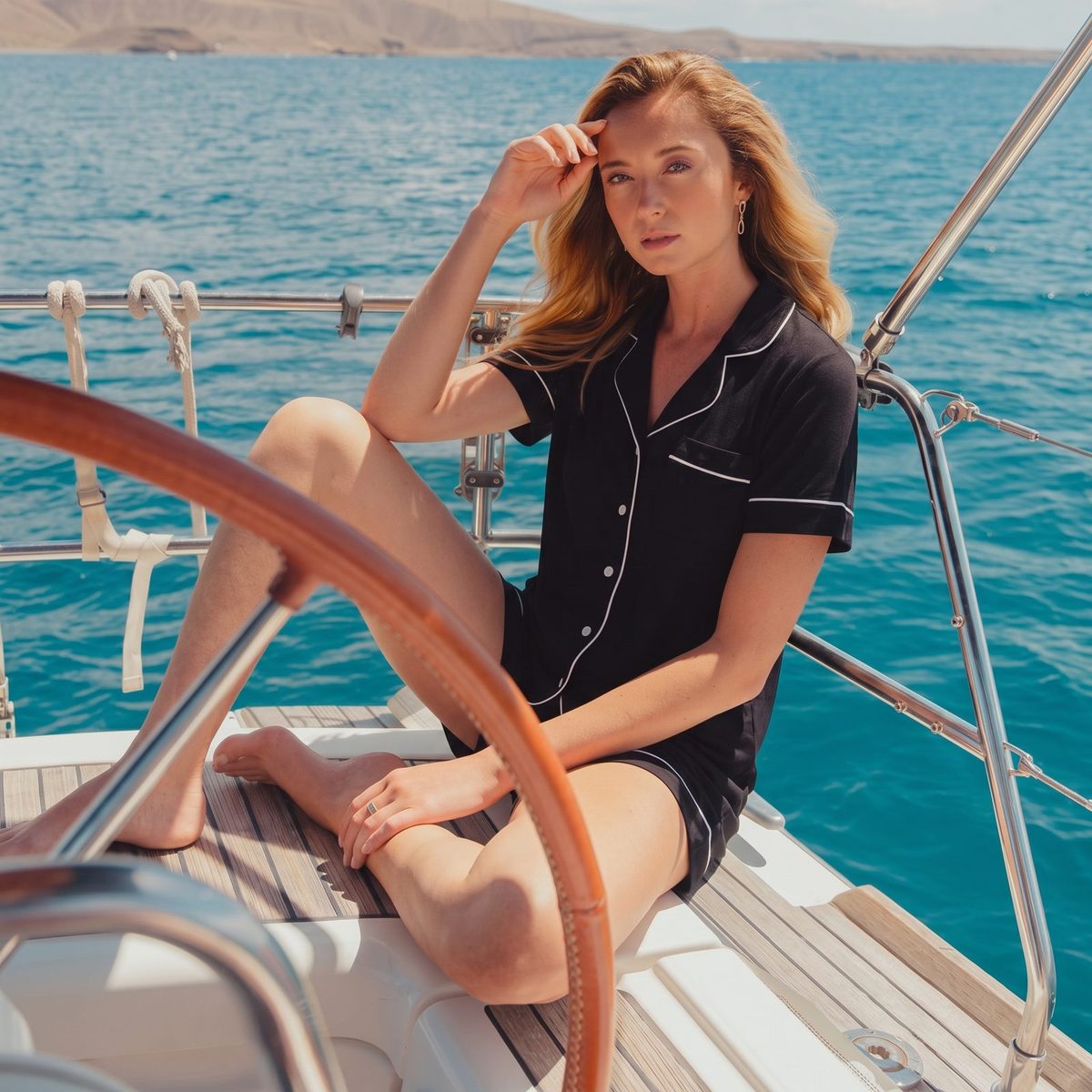
Black satin set, hard sun, blue water. The product reads as evening wear, which doubles its use.
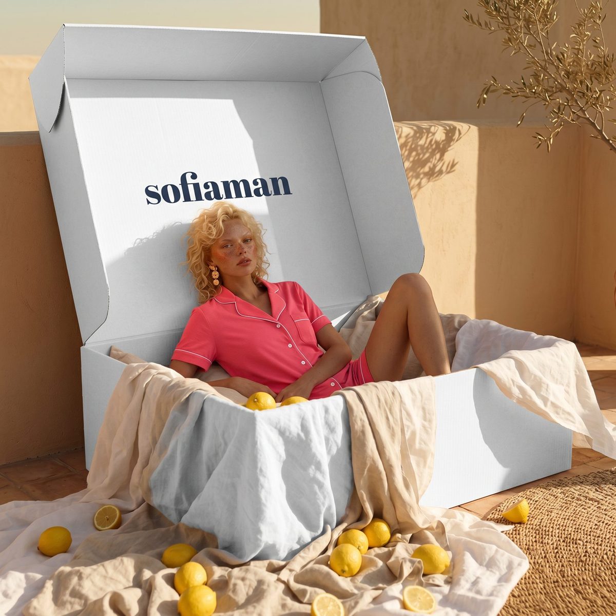
The delivery box as a set. The brand mark is in the scene, not stamped on top of it.
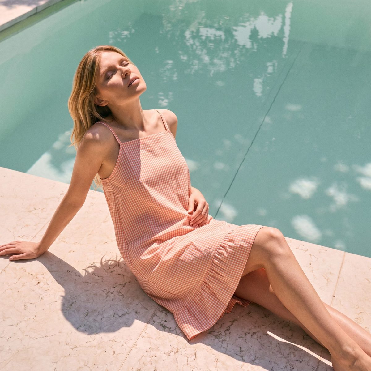
Peach set on blue tiles. One colour contrast per image, so the garment is always the brightest thing.
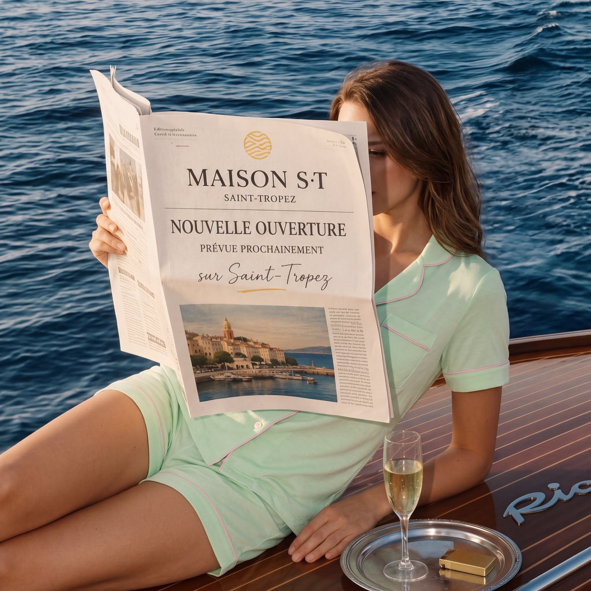
The face hides behind a Saint-Tropez front page, so the mint set and the deck tell the story. A holiday you can read at a glance.
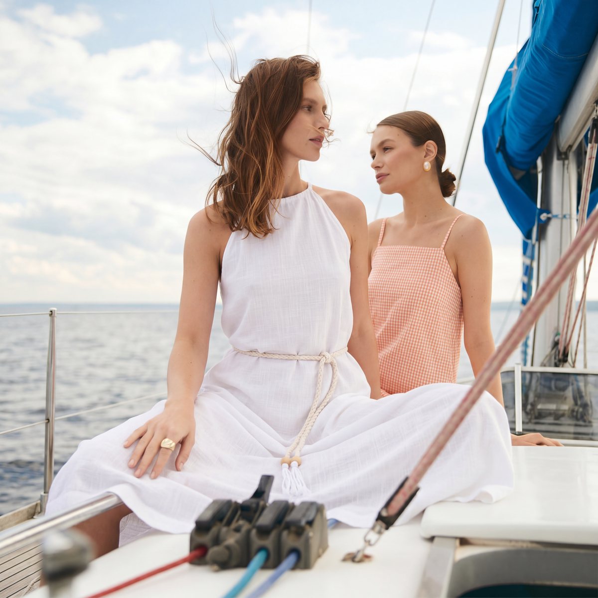
White linen leads, gingham supports. Two pieces from the same collection, staged as two friends rather than two products.
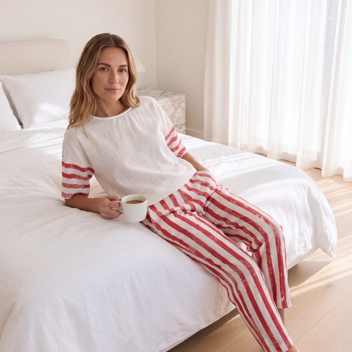
A striped set, white sheets and a cup of coffee. No sea, no sun: the bed is the holiday.
Decision
Price sits in the ad copy, where it can be tested without re-exporting creatives. The image stays usable after the sale ends.
Decision
Even in the two-person frame, one piece leads and the other supports. The ad links straight to the lead product’s page.
Decision
Hard noon sun on the yacht, soft shade in the garden. The lighting tells you where you are before the copy does.
The result: the summer campaign ran on scenes instead of percentages, and the same images were reused for the end-of-sale push in August with only the copy changed.
AI imagery
Generation is the cheap part. The work is making the garment in the image the garment in the shop: the exact mint, the piping, the collar shape. A customer who orders the pyjama from the ad has to receive the pyjama from the ad.
So the decisions come before the first prompt. Every scene starts from a brief that fixes the mood, the light and the pose, so generation is a couple of small batches, not a lottery. Then the product: the catalogue garment composited and retouched into the chosen frame, fold, shadow and skin contact rebuilt by hand, and checked against the brand before it ships.
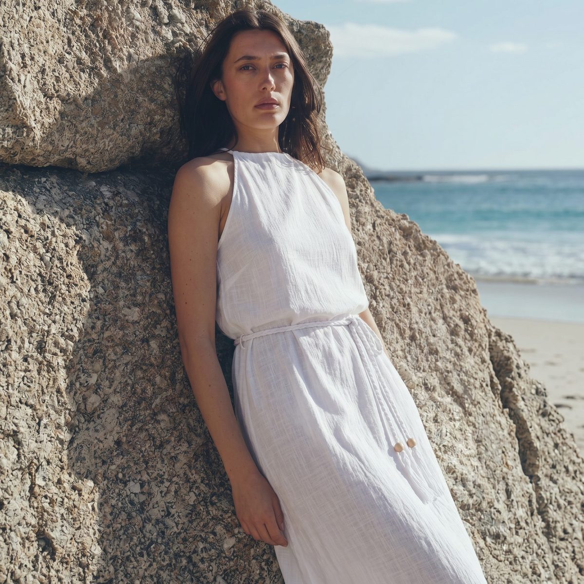

01
Noon sun to make the fabric’s sheen read on a phone screen.
02
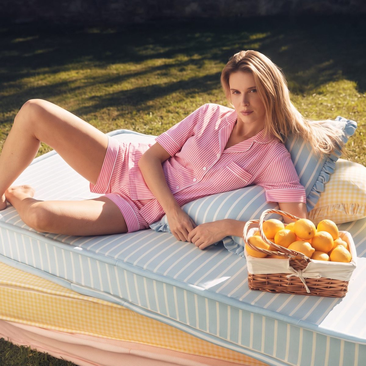
White linen on white steps in hard sun. Only frames where the weave still reads made the cut.
03
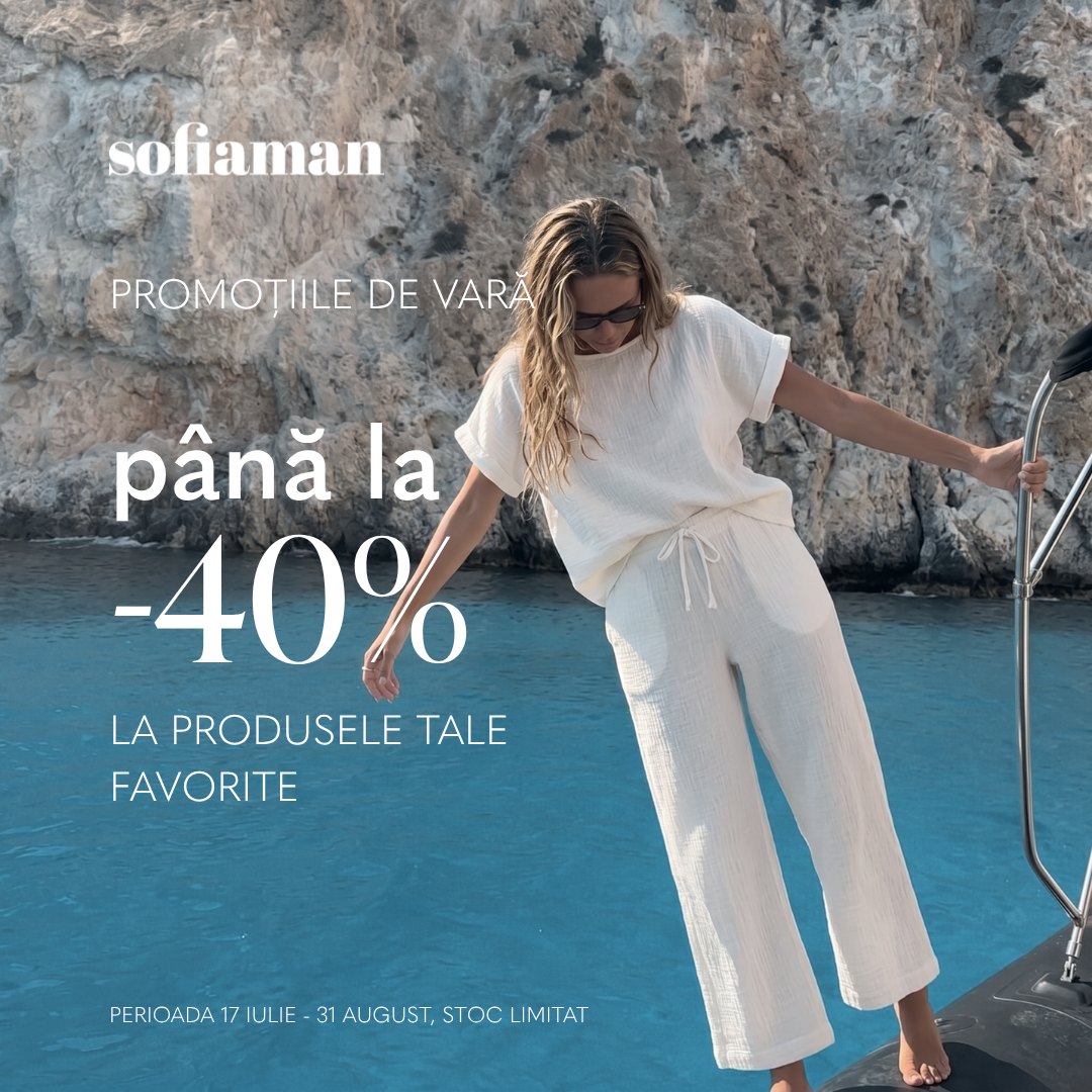
Crinkled cotton gauze against rough limestone. The headline sits on the calm water, never on the garment.
04
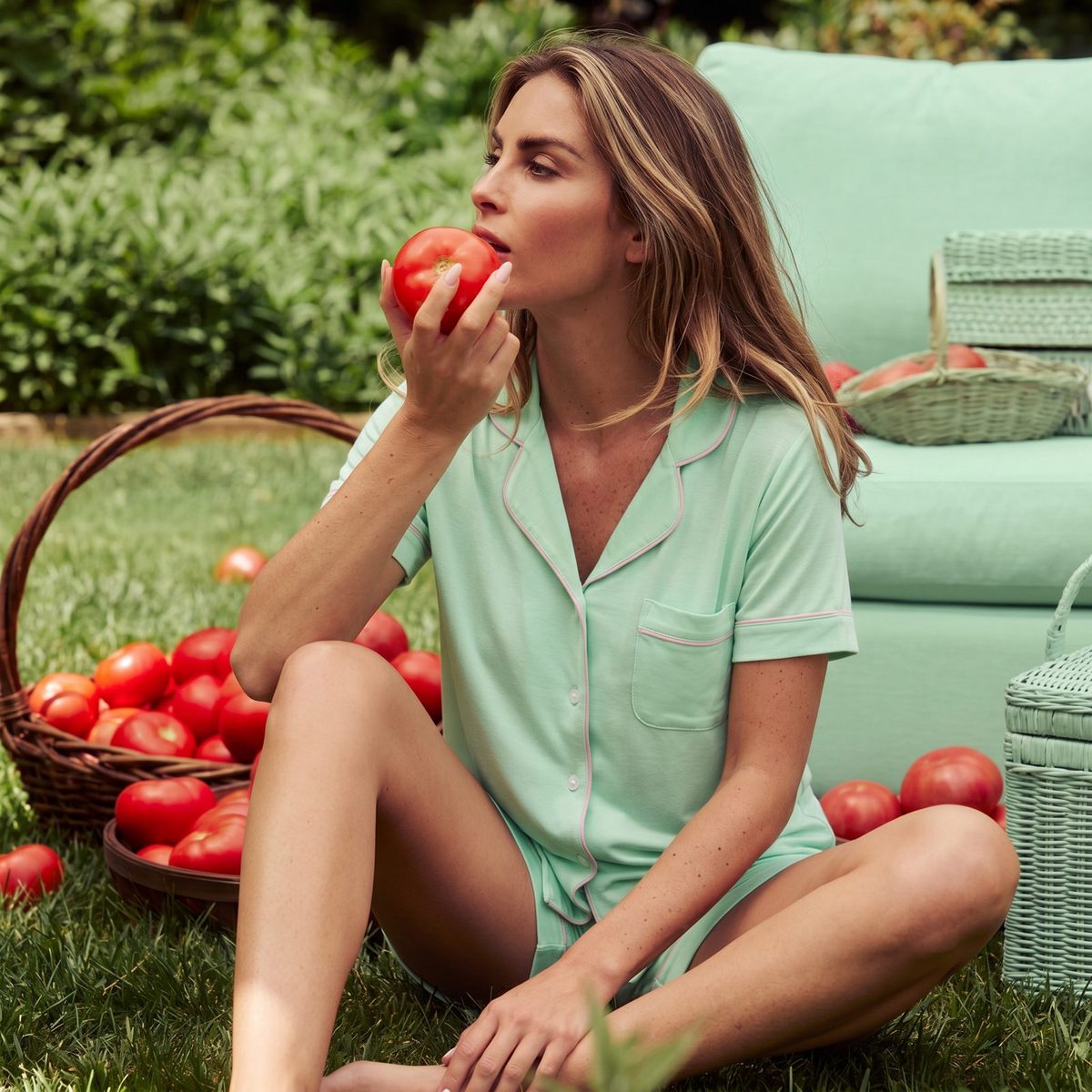
Lemons, tomatoes, linen: a summer kit that repeats across the series.
05
Best performer of the set, reused for the newsletter hero in July.
Decision
AI invents fabric. Customers notice. The garment is always the catalogue photo, composited in.
The result: ten scenes that read as one art-directed campaign, each built around the real garment and ready in four formats, with the scenes themselves generated in under a day.
Layout system
Each month needed the same idea in 1:1 for feed, 4:5 for Instagram, 9:16 for stories and TikTok, and 16:9 for the website. Resizing by hand was where the hours went, and where the headlines got cropped.
I set up one master frame with safe zones for every ratio: the headline lives top-left inside the tightest crop, the logo bottom-left, the subject on the right third. Generated backgrounds are made wider than needed so the 16:9 has room. A new concept is one layout and four exports, not four layouts.
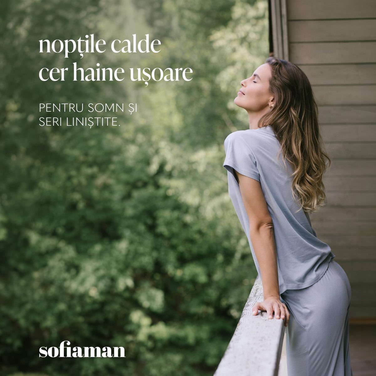
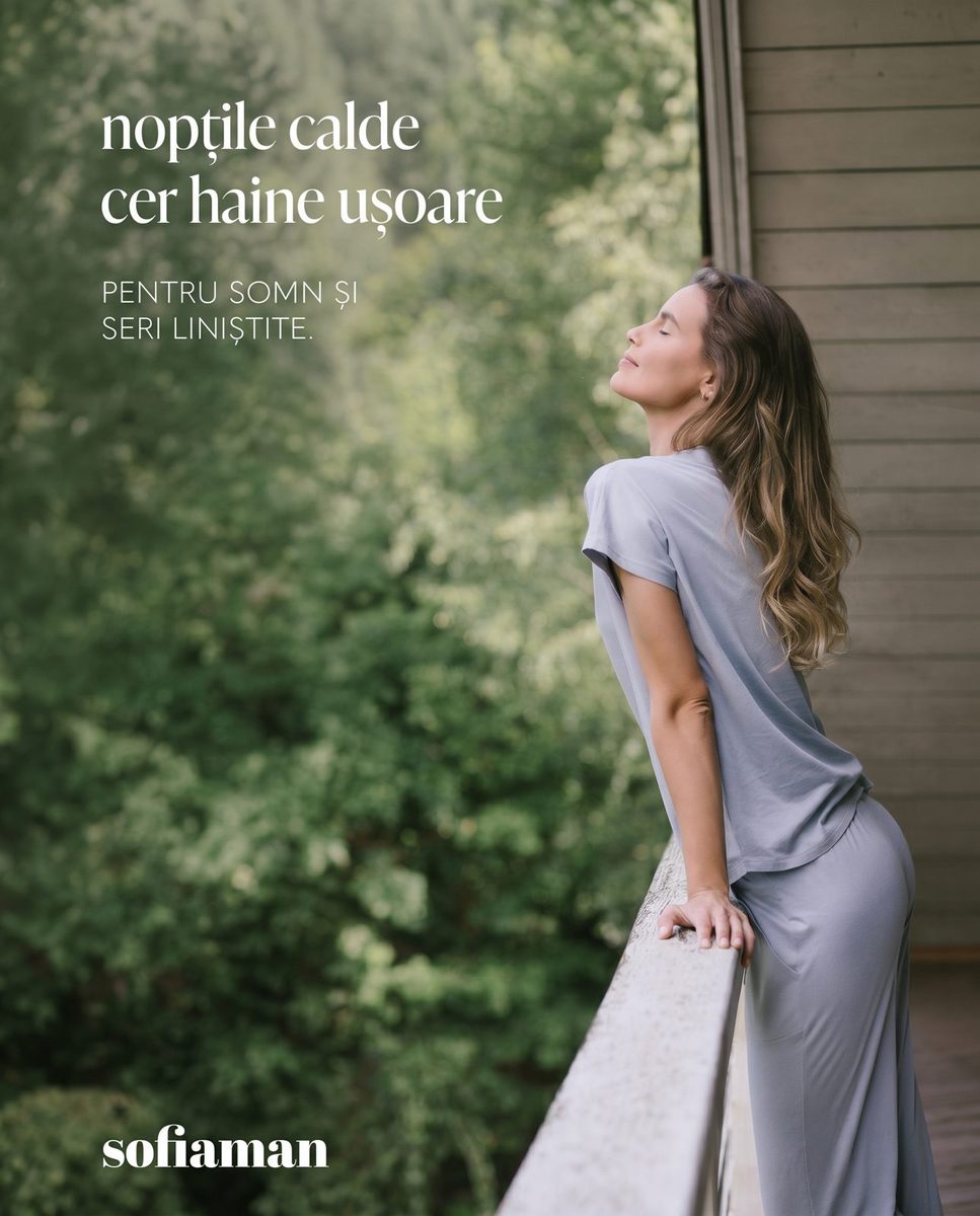
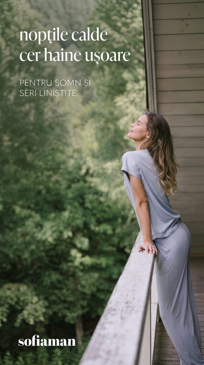
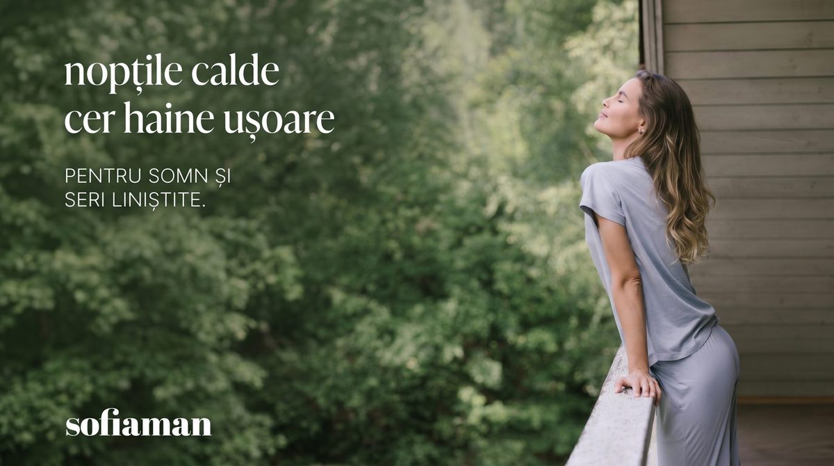
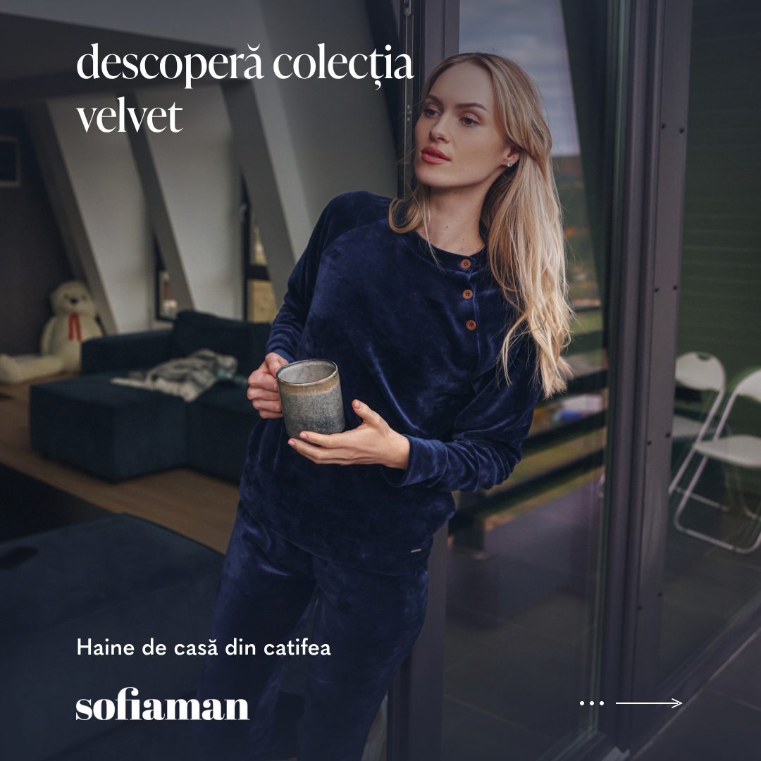
Same grid, dark variant. Ten collections, one afternoon.
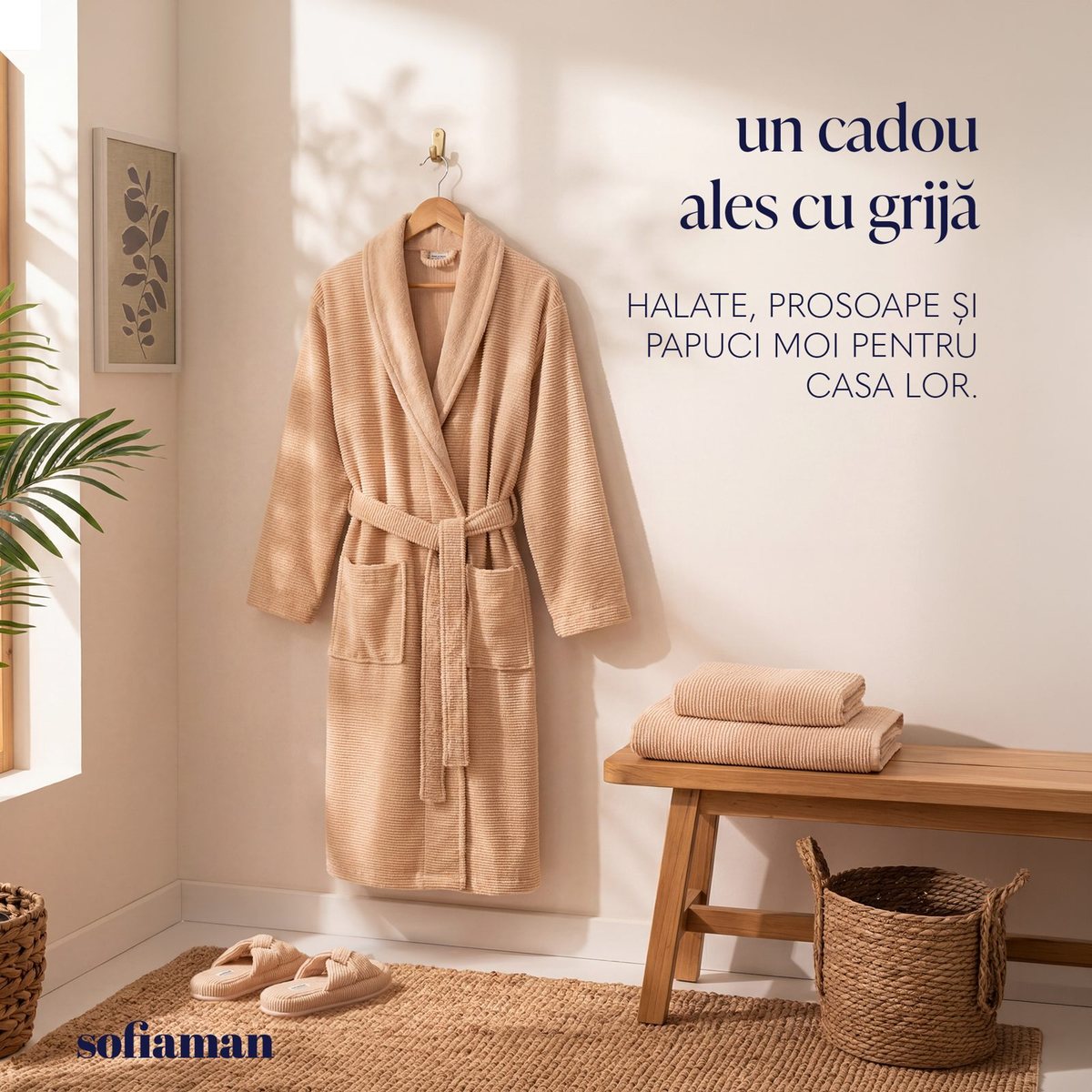
Light variant for the gifting message, headline in the same corner.
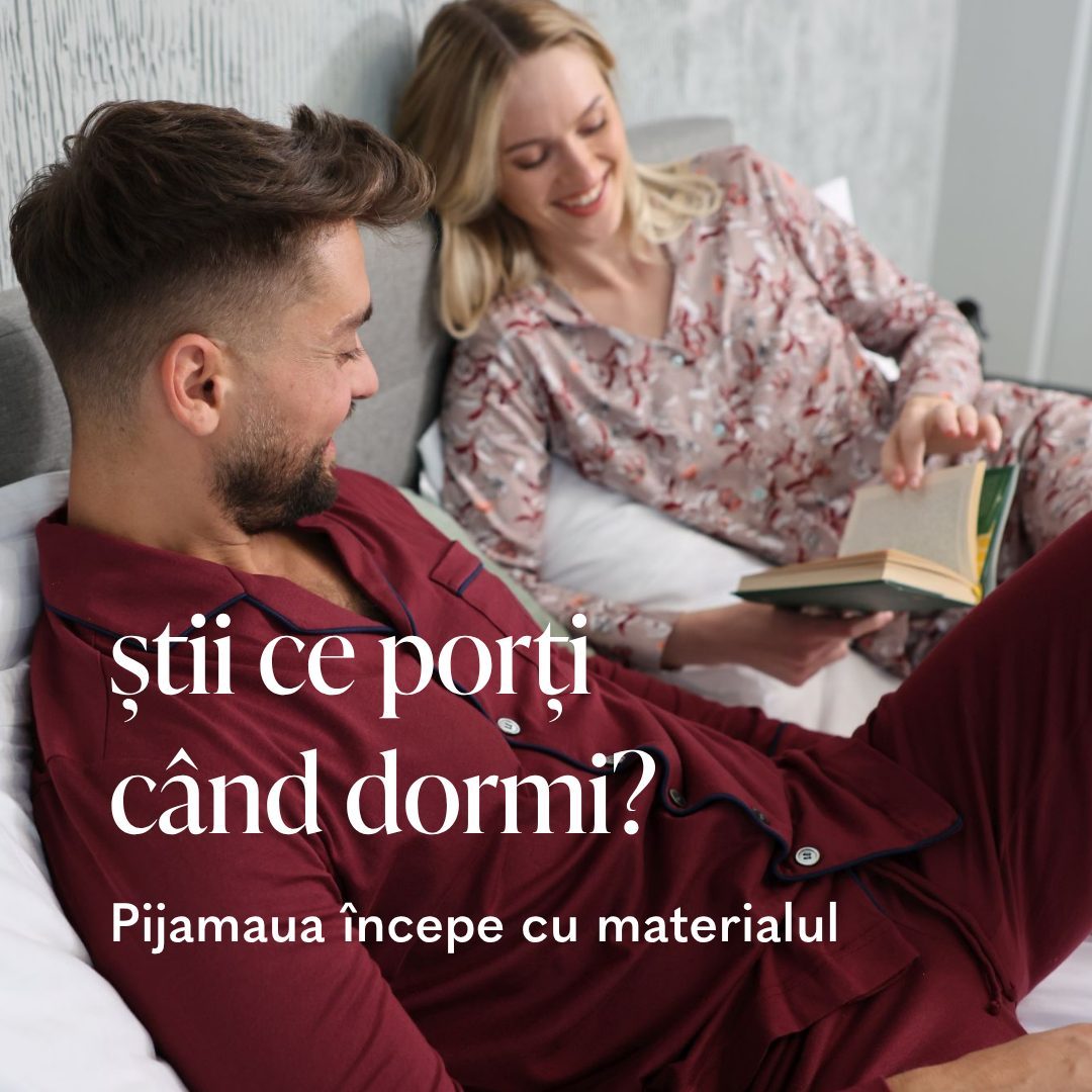
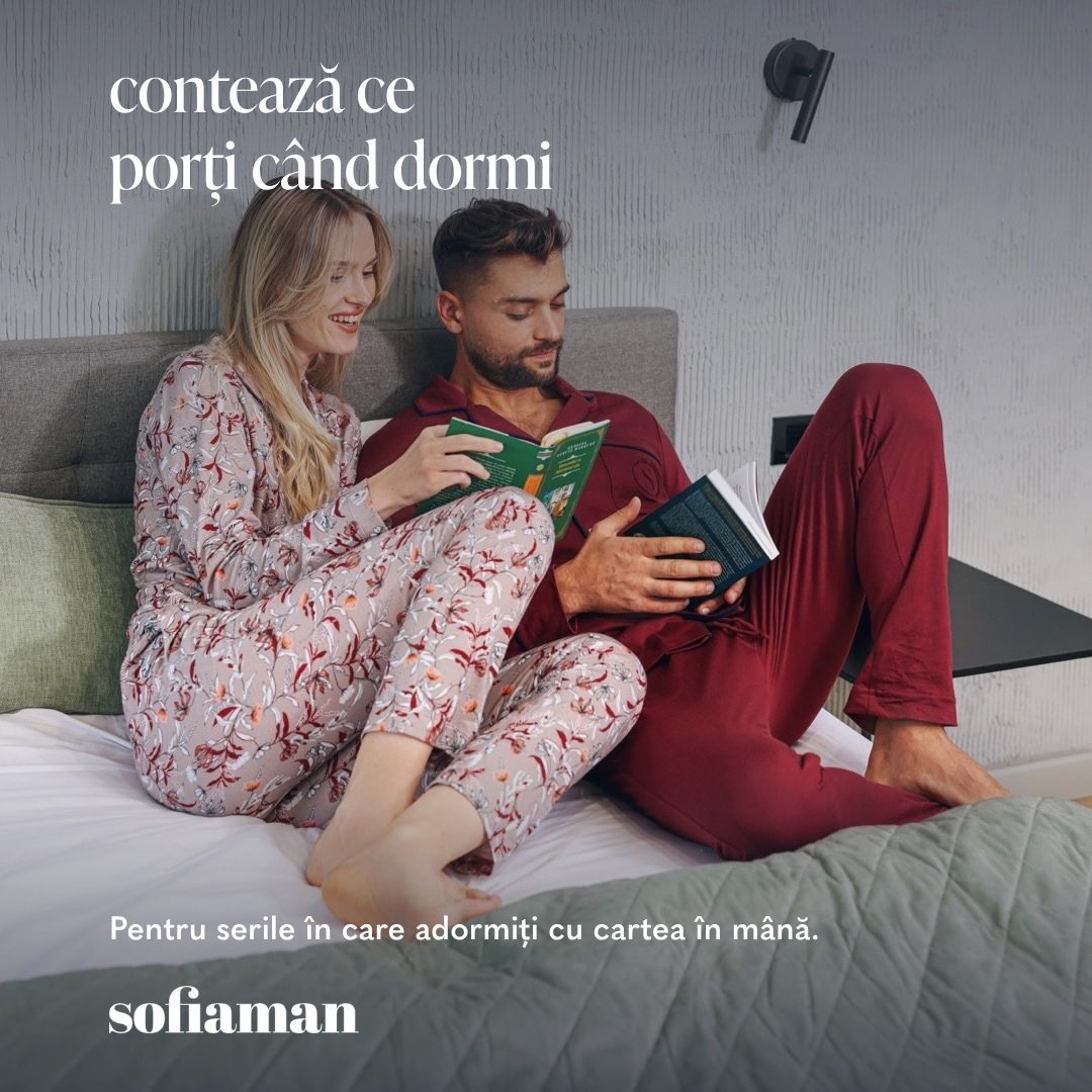
The grid holds even when the subject is a couple and the headline is a question.

The one place I broke the palette: loud yellow and a retro phone, so the early-access list stands out in a feed full of discounts.
The result: production time per concept dropped from about three hours to under one, and no headline has been cropped by a placement since July.
Educational content
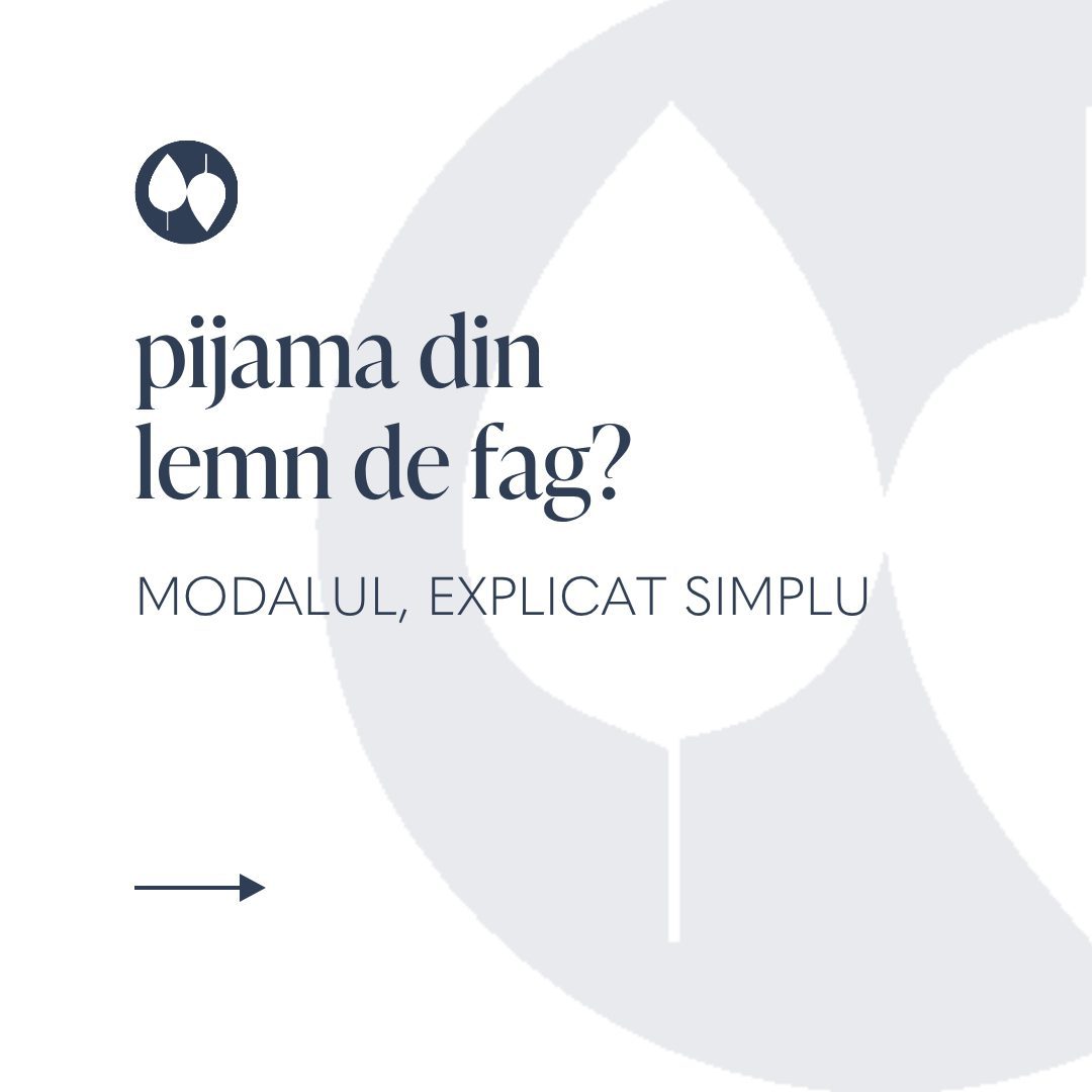
Sofiaman’s best fabrics have names most customers don’t know. Modal, micromodal, bamboo viscose. In the ads, those words were doing nothing. So every month got one carousel that explains one fibre, in five cards, with the leaf mark and the brand serif doing the brand work.
The structure is always the same: a question on the cover, three facts in the middle, the product at the end. People save explainers, and saved posts keep working after the ad budget stops.
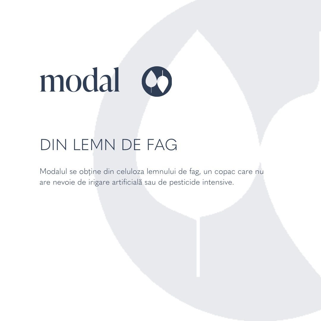
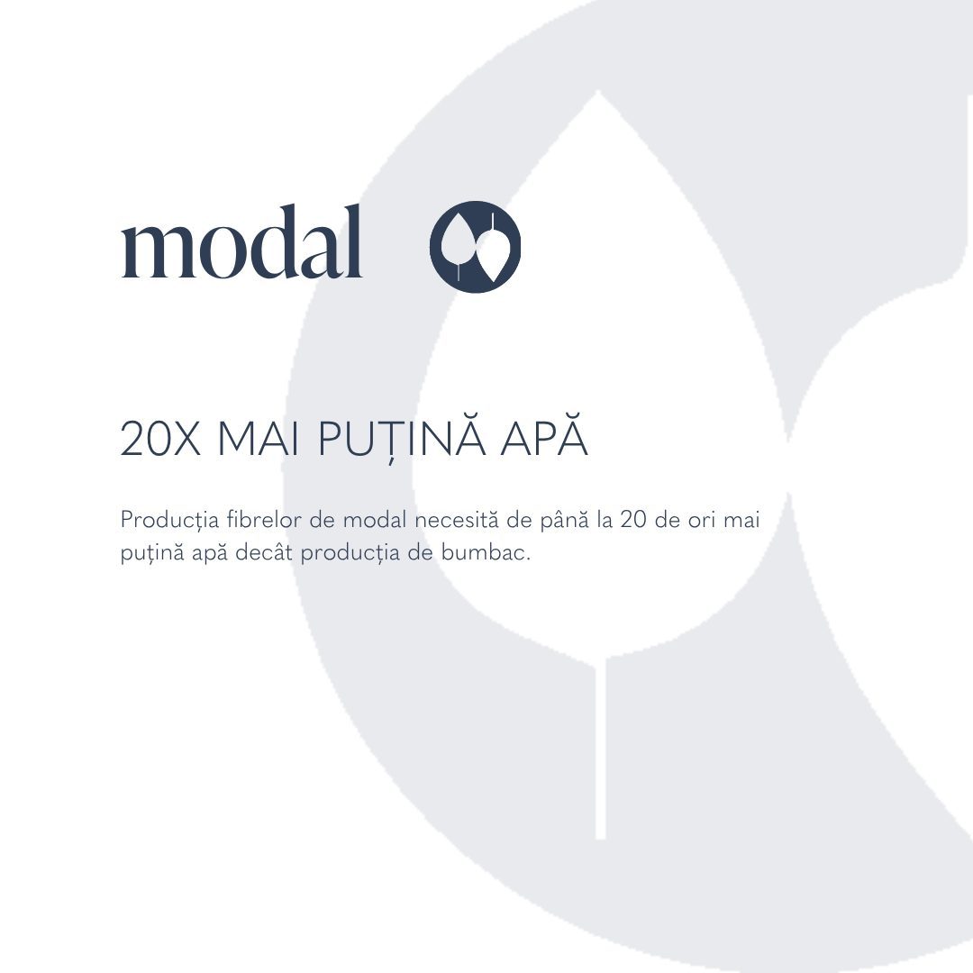
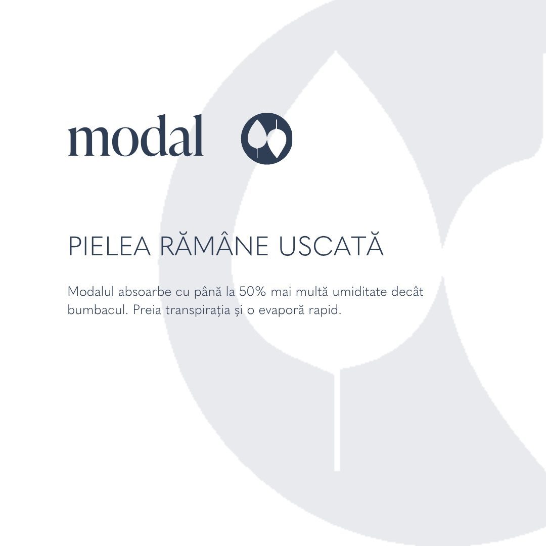
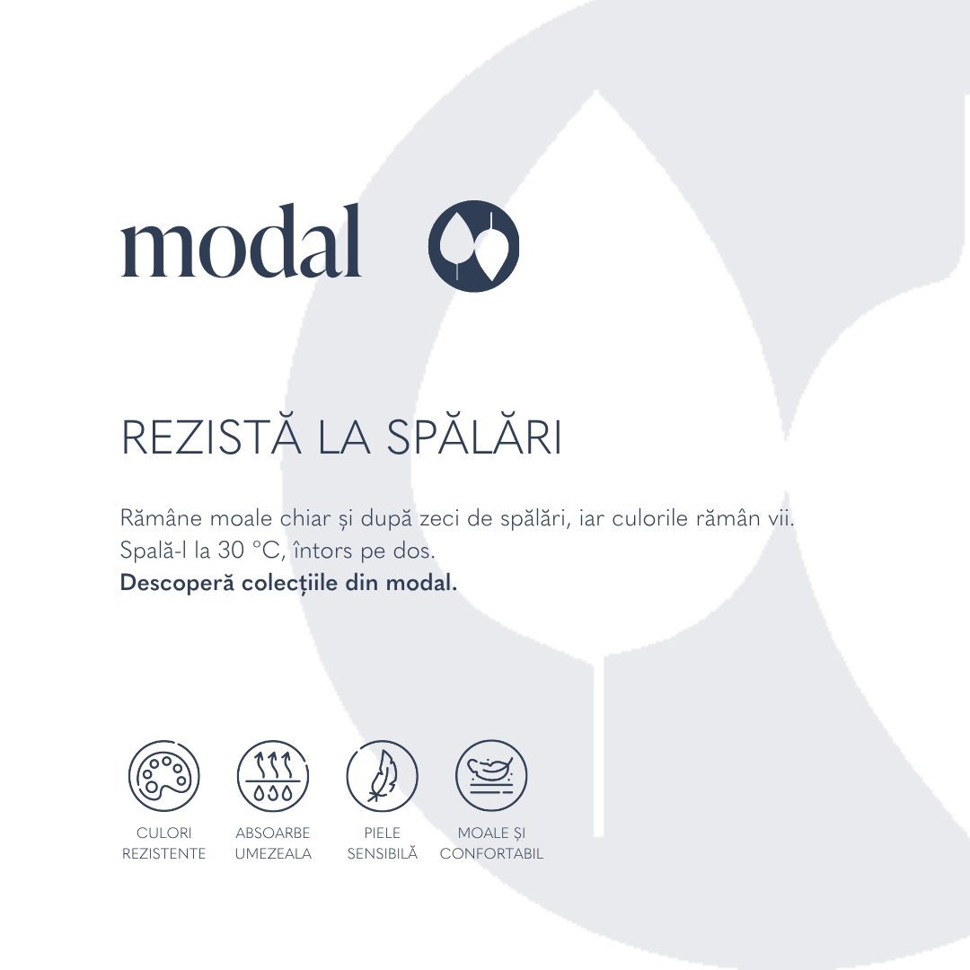
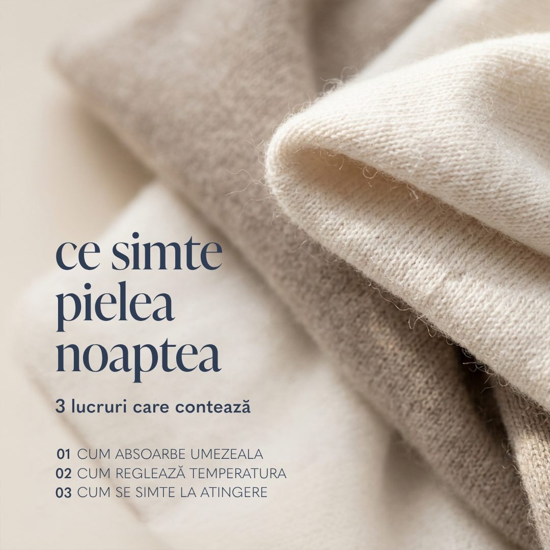
Macro shots of the real fabric, no model. The texture is the whole message.
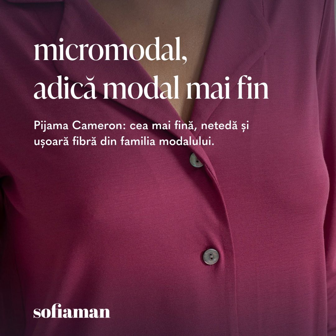
One sentence per card: micromodal, adică modal mai fin. Written the way a shop assistant would say it.
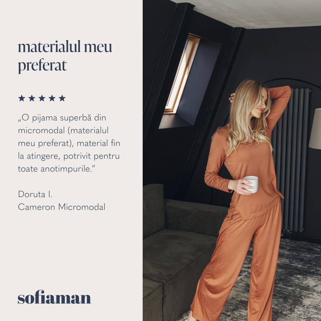
Twenty real reviews, typeset with the product they talk about. Some of the simplest creatives of the year, and among the best performing.
Short video
Sofiaman has one feeling: soft, calm, at home. But the people who buy it don’t all respond to the same thing. So I generated the videos with AI in three creative directions, each written for a different audience, all carrying the same brand vibe: a playful one, a sensory one and a summer one. The pyjama stays in frame the whole time, so the product is always the content.
For a younger audience that shops on TikTok. A quick outfit change with a punchline, the set in frame from start to end.
For people who buy on feel. Slow close-ups of piping, buttons and fabric, built to work with sound on or off.
For the holiday shopper. A slow walk in the sun in the striped twin-cotton set, the stripes doing the moving.
Email was the channel with the best margin and the weakest design: long, image-heavy, one CTA at the very bottom. I rebuilt it as a template with a fixed order: the offer and the button in the first screen, a code card, a fabric picker, four products with prices, one fabric explainer, one review, a trust row and a final CTA. Every module is optional except the first and the last.
Headlines, prices and buttons are real text, not part of the images, so they still show up when an email app blocks pictures. Apple Mail renders them in the brand’s IvyPresto and Quasimoda; Gmail falls back to a close system font.
Scroll the email. The note follows the section you’re on.
Preheader
“Ultima zi, până la 23:59” is the first line in the inbox preview, so the reason to open arrives before the brand does.
Hero
The hero fades to white exactly where the headline starts. Image, offer and button share the first screen, with no box drawn around the text.
Code card
15EXTRA, the condition and the deadline sit in one navy coupon under the hero, so it reads as a bonus, not as fine print.
Fabrics
Three fabric close-ups let people pick modal, micromodal or cotton first. For a brand that sells on touch, the material is the real filter.
Products
Shop photos on the model, the old price struck through and one “ultimele mărimi” tag for scarcity. Every tile opens its own product page.
Proof
A short “why modal” explainer, then one five-star review, then the last button. The objection is handled before the ask.

Results
The system gave the brand a visual language of its own: fabric first, the real garment in every frame, one grid across every format.
link CTR on Meta for the AI-imagery summer campaign, against the spring campaign before it
What I learned: the generated part is never the hard part. The hard part is the discipline around it, the garment match, the selection, one light and one palette across a campaign, and that is what makes it look like a shoot.
Questions
The generated image only provides the person and the place. The garment is the catalogue photo, composited and retouched into the frame, then checked against the product photo and the brand before anything ships. If the colour or pattern can’t be matched, the frame is dropped.
One light recipe and one palette per campaign, and a repeating prop kit. Variety comes from the faces, the locations and the garments; consistency comes from the light and the colour.
Many promo emails are one big picture, so when an email app blocks or delays images, the reader sees an empty box. Here the headline, prices and buttons are typed as real text, so they show up anyway, screen readers can read them, and changing a price takes a minute instead of re-exporting a banner.
Keep reading